


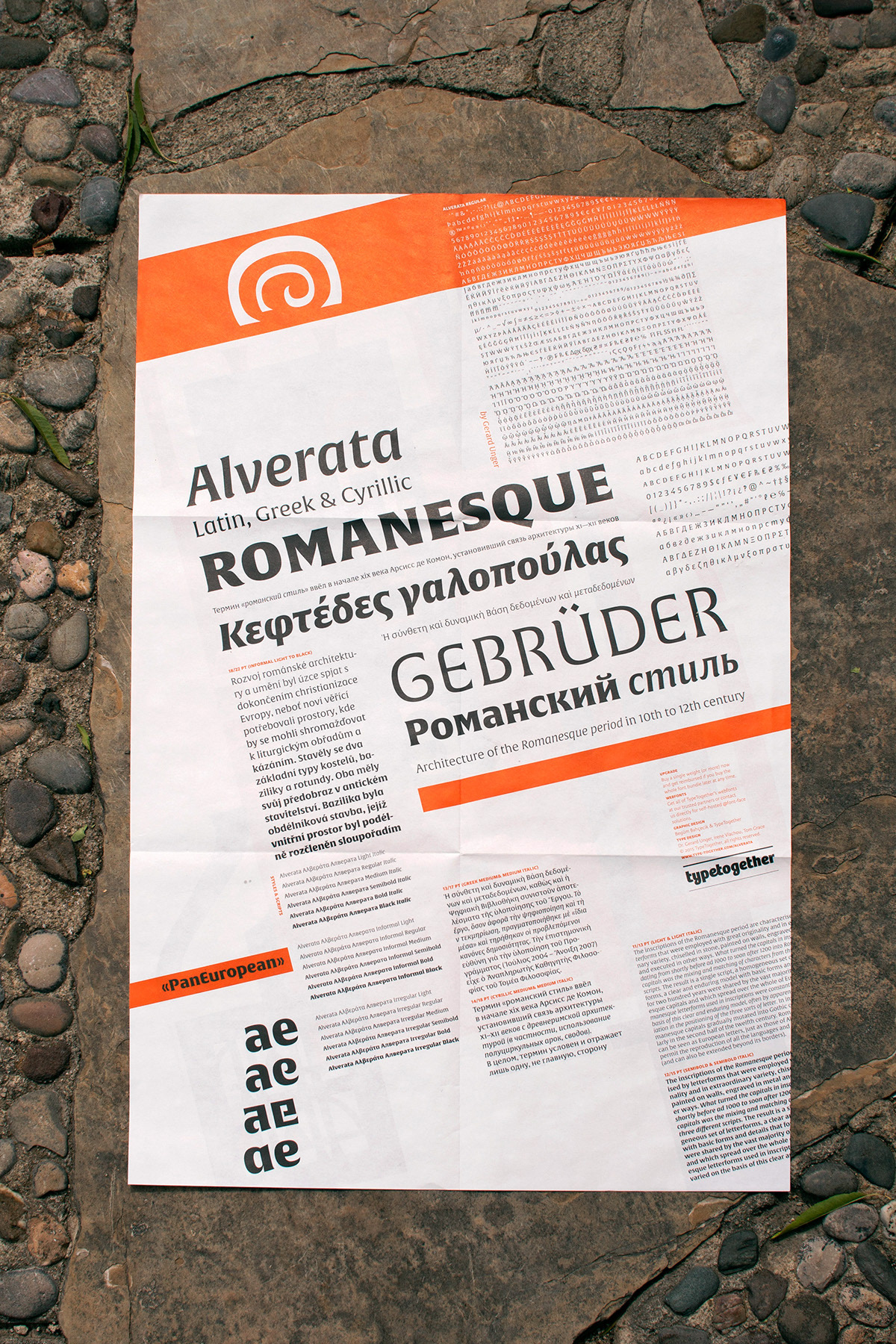
ALVERATA
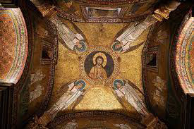
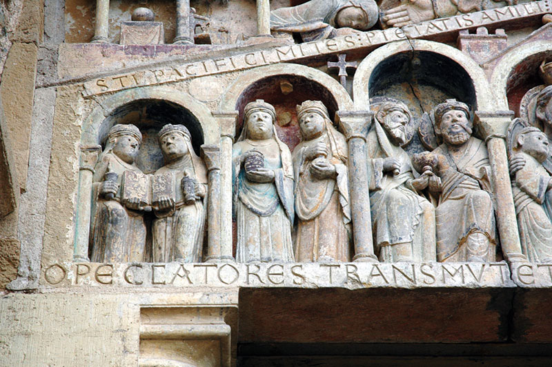
For "Alverata", I wanted to design a traditional type specimen poster. Like the font itself, I was inspired by ancient Roman architecture. I wanted to embody the font origins into the design as best as I could, so I played around with the various letterform structures.
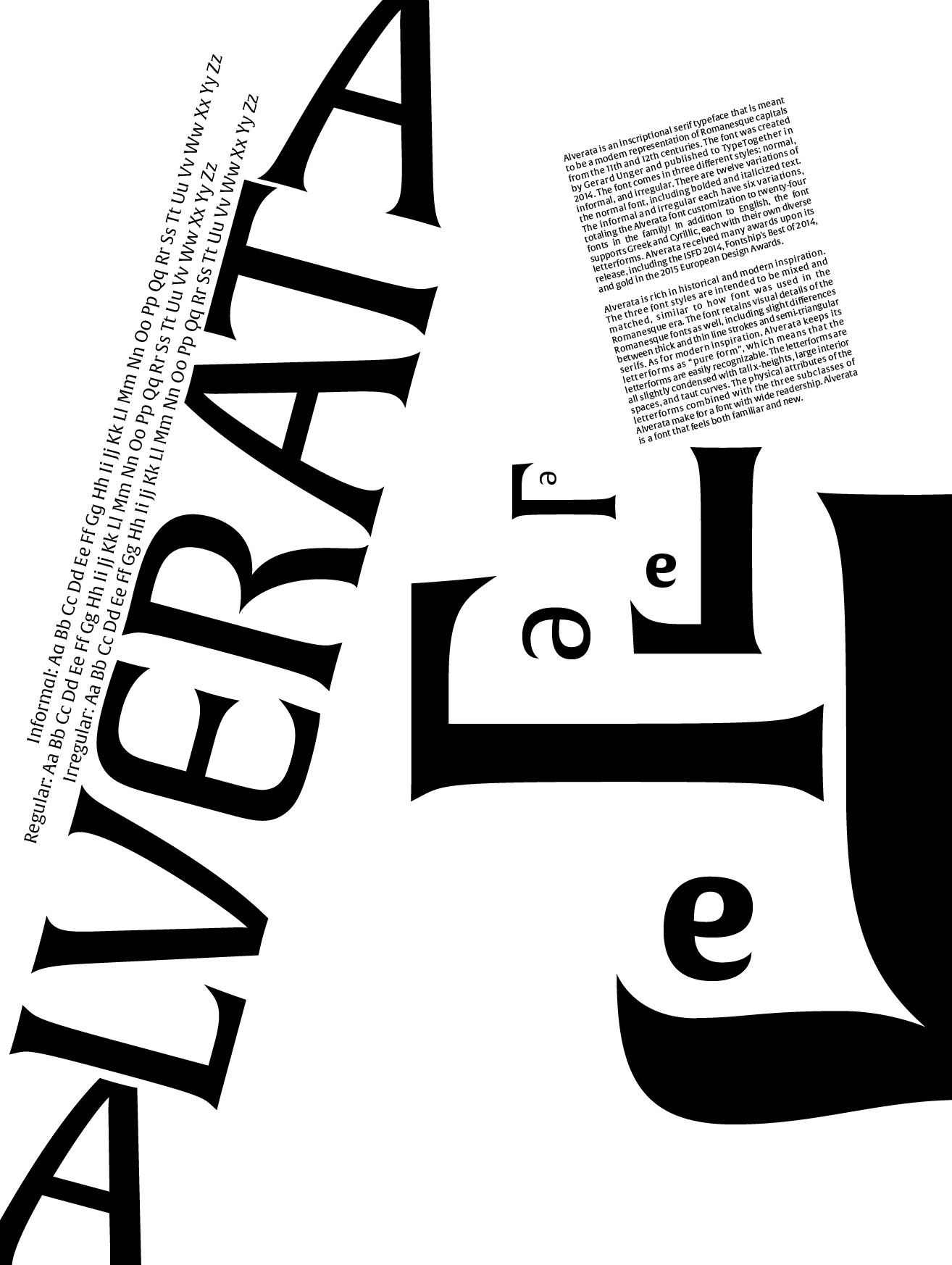
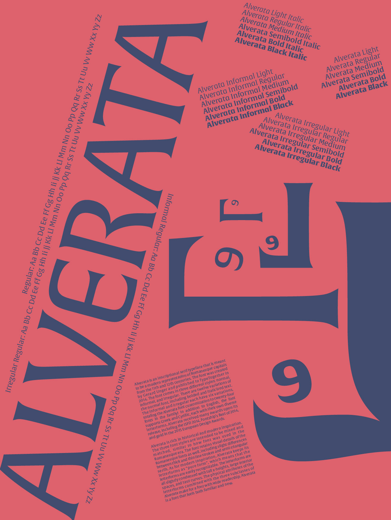
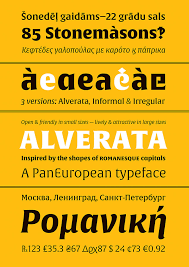
Initially, I tilted the "A" letterforms in "Alverata" on their sides. I believed that they resembled a pillar more that way, but upon critique, I realized the flaws in this design approach.
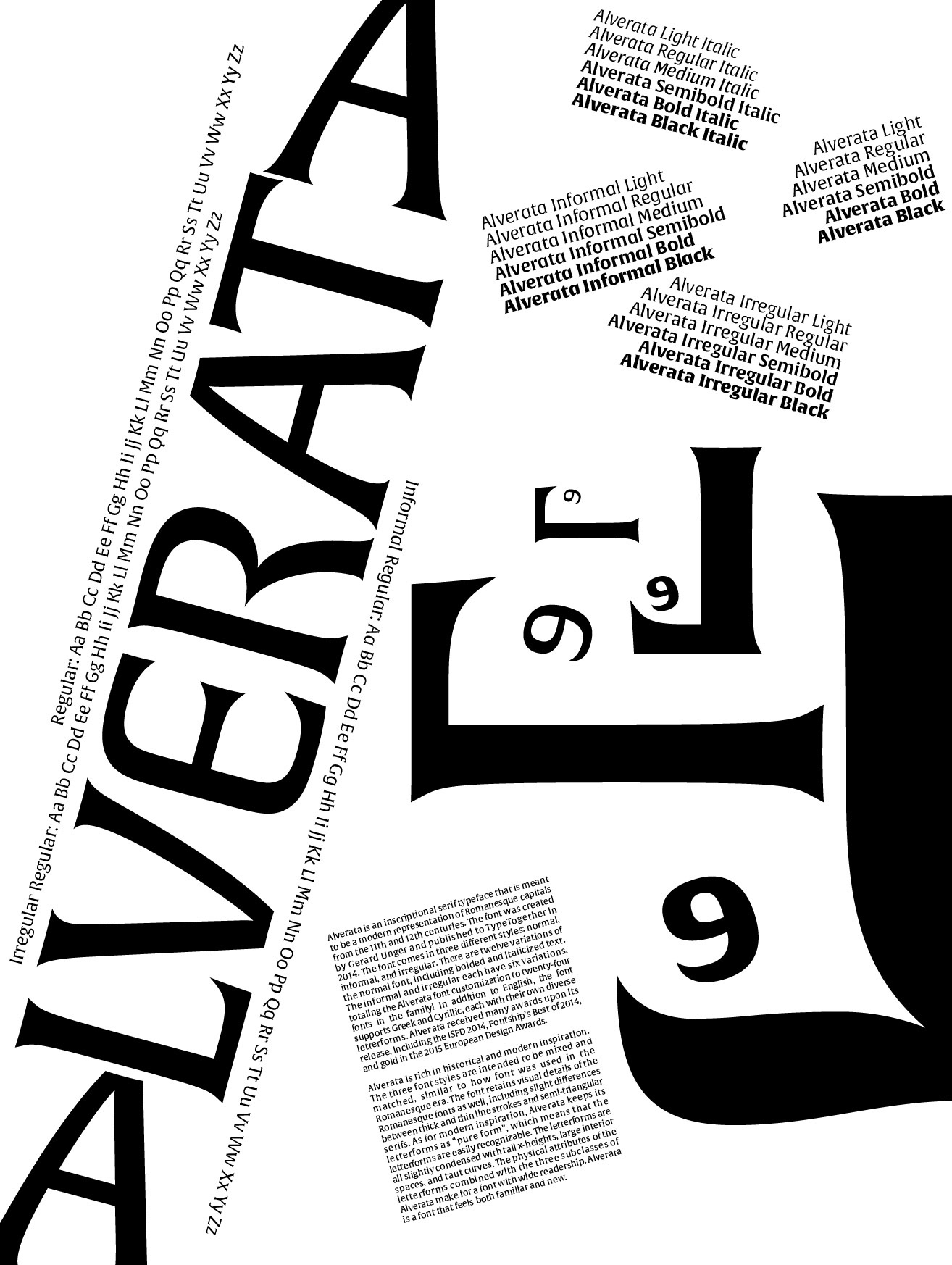
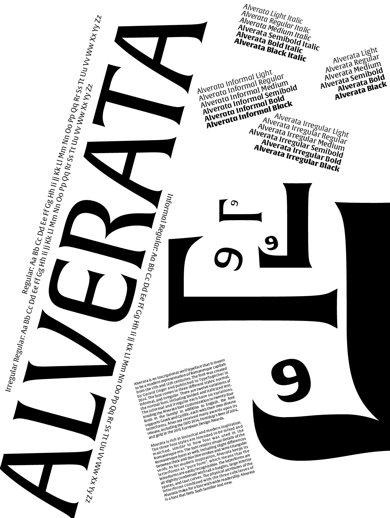
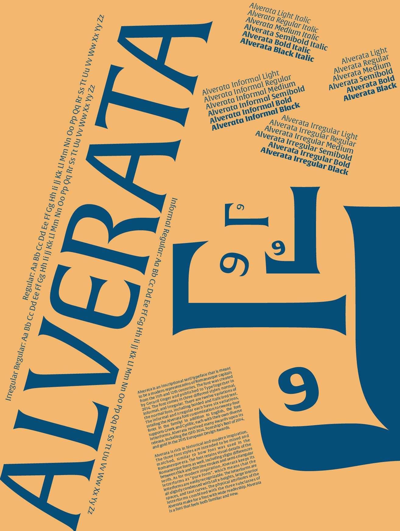
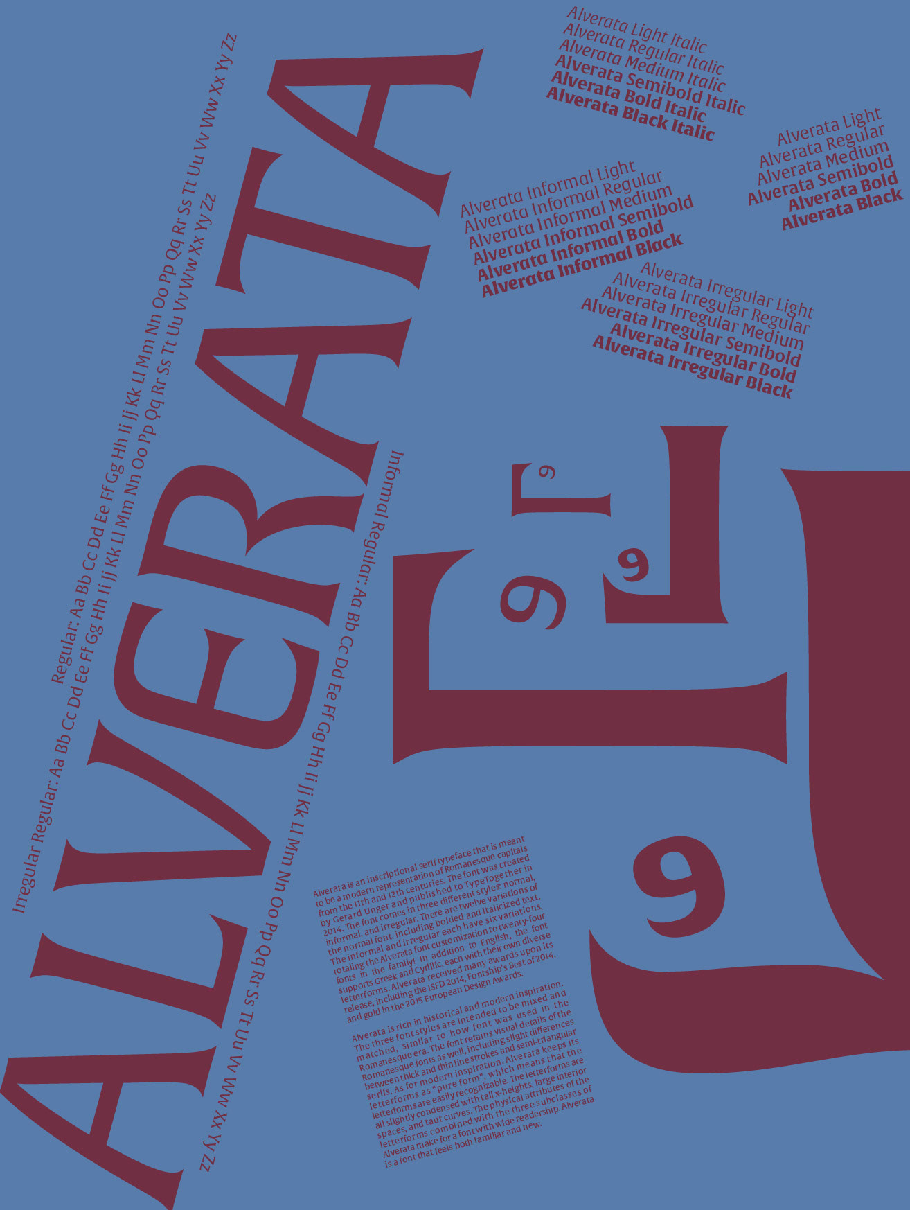
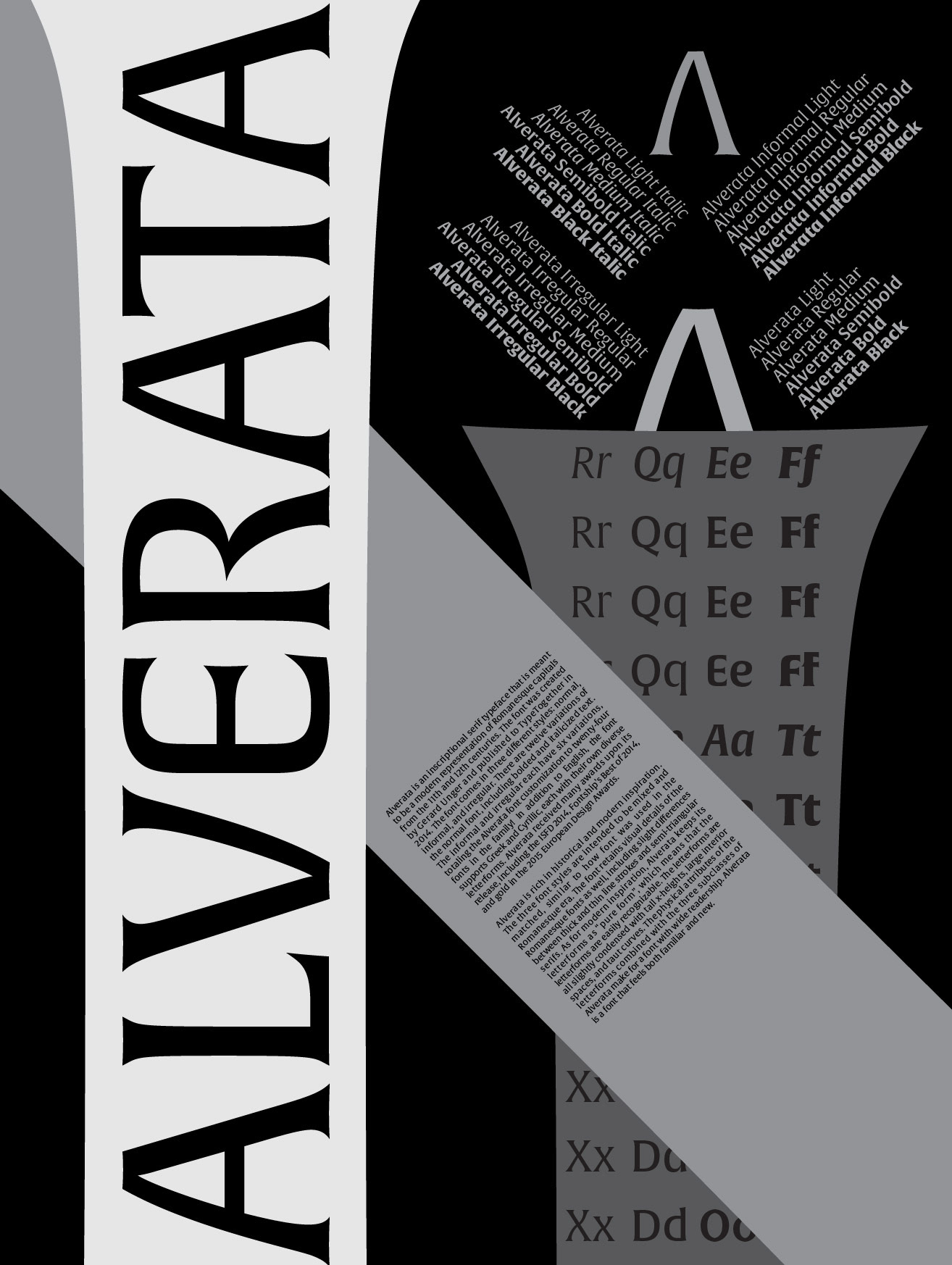
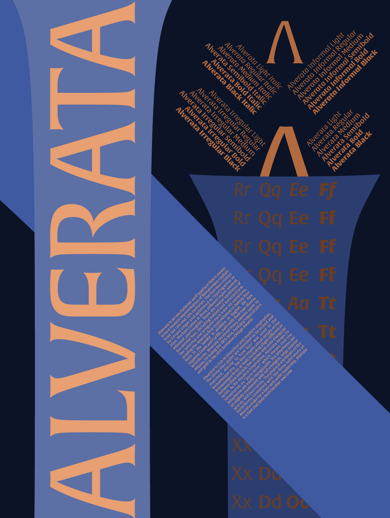
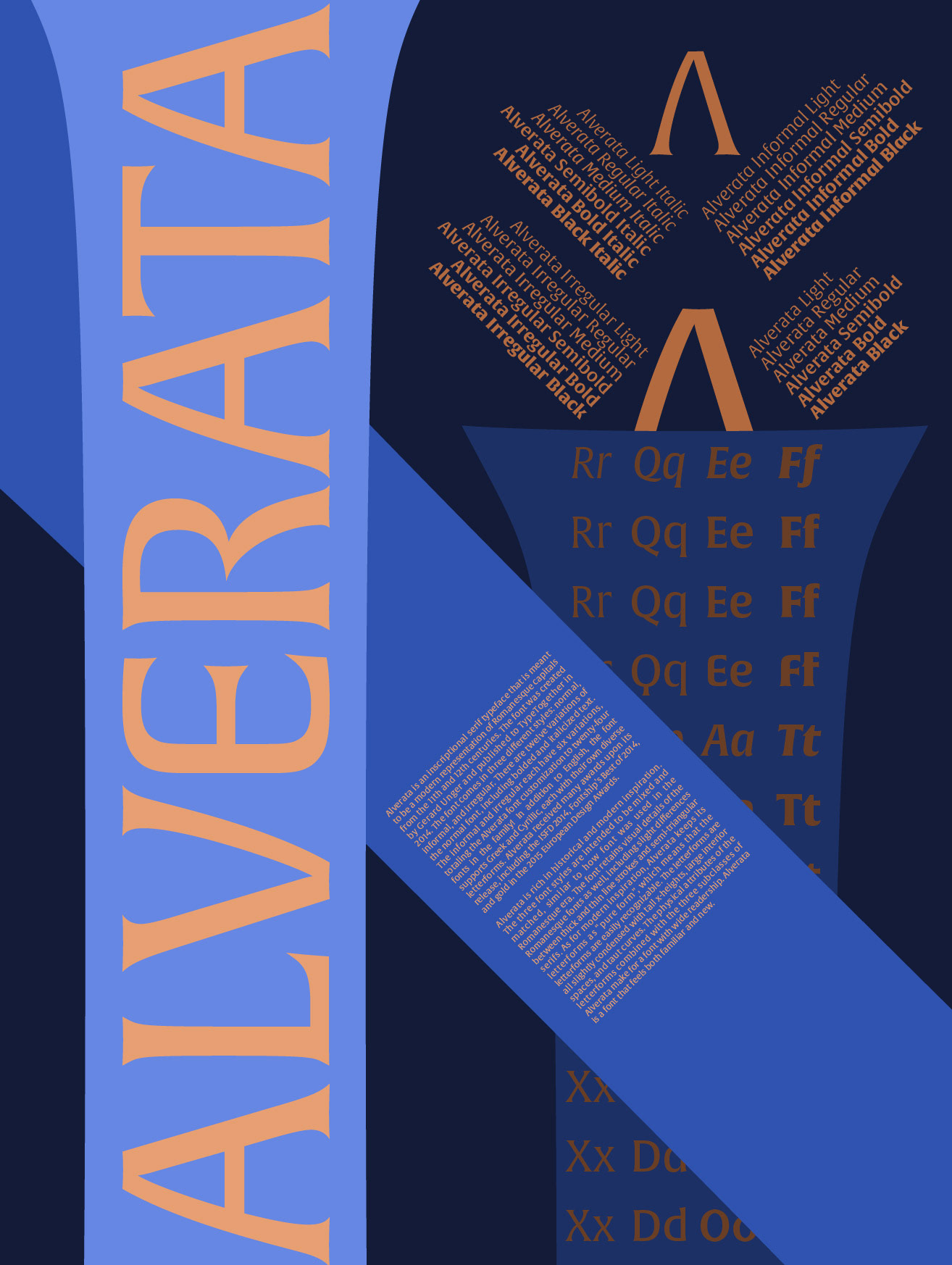
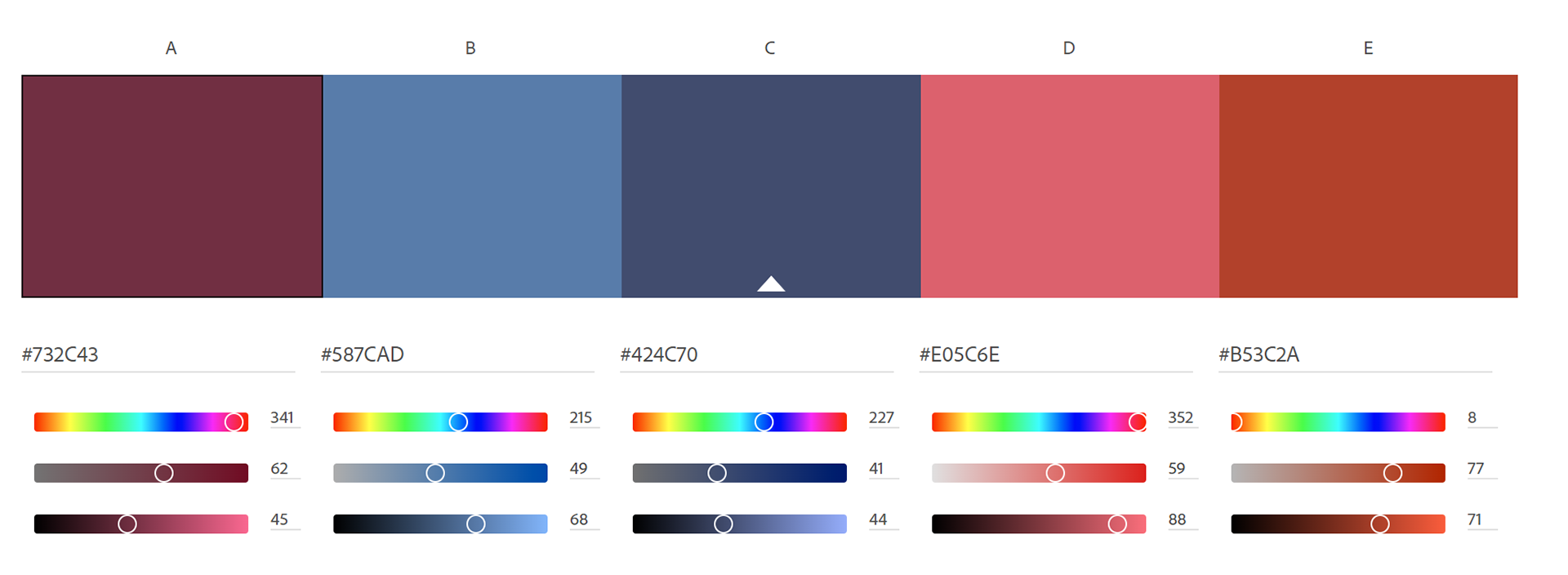
I then tweaked the design around and played with color. I was satisfied with version 2 of the type specimen poster, but I wanted to experiment more with designs. Version 2 works as a type specimen poster as well.
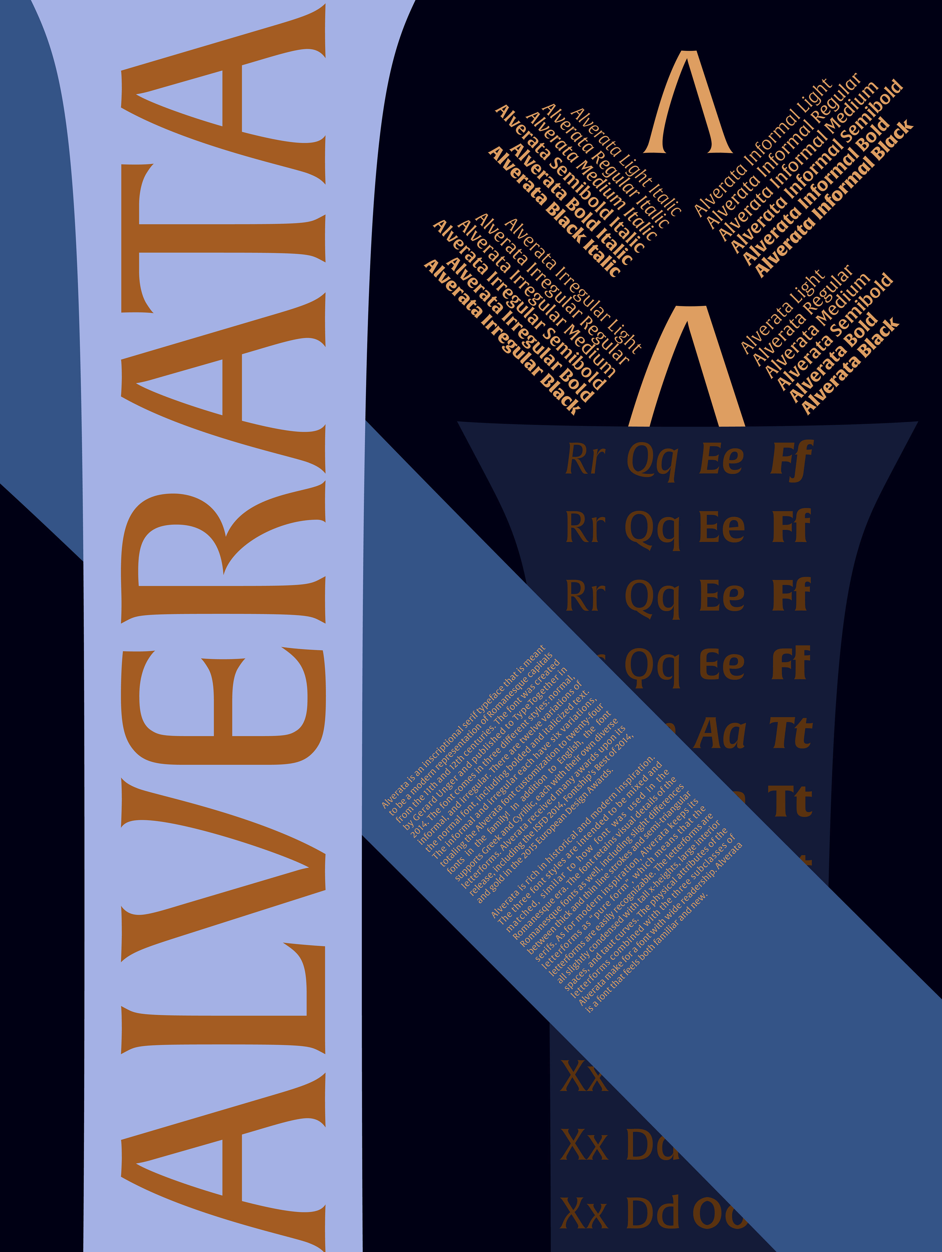
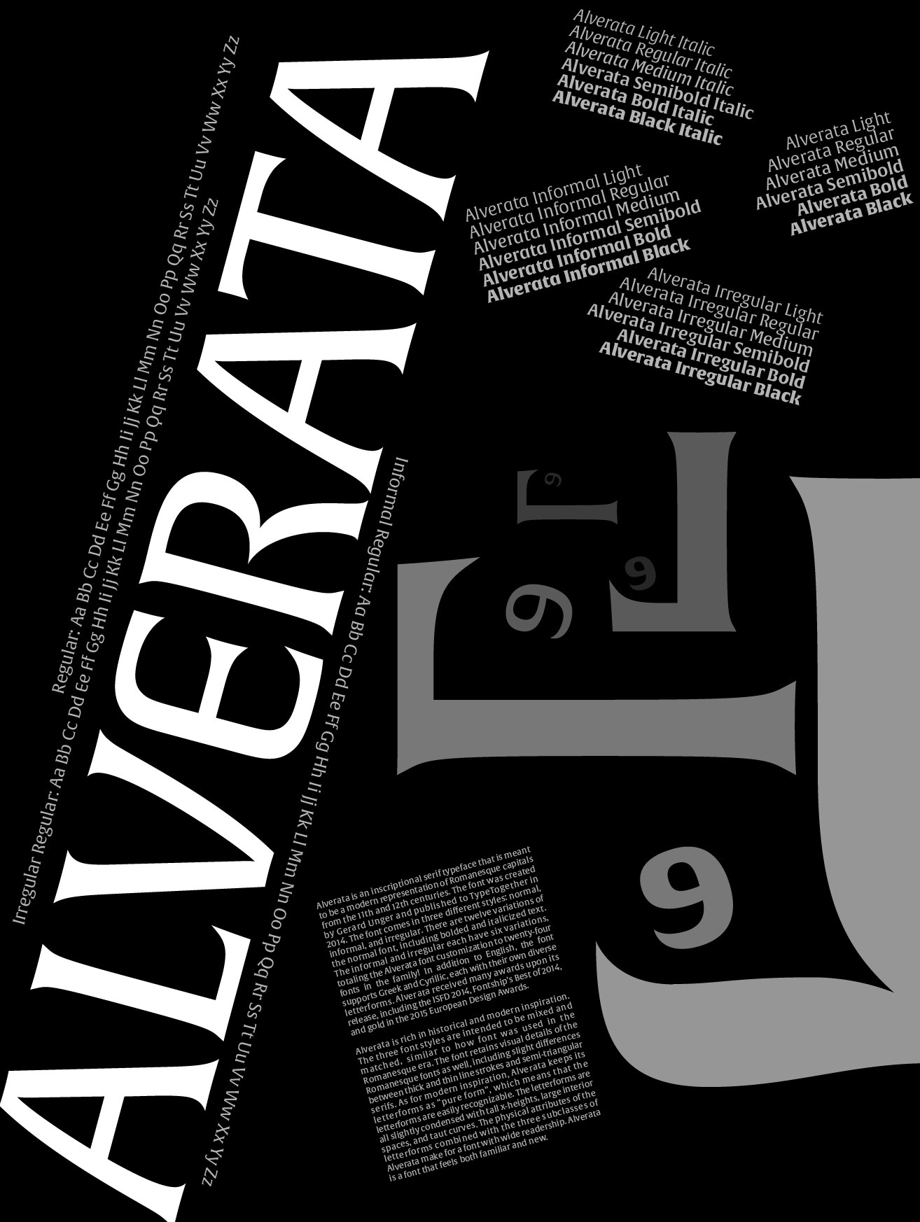
Ultimately, I settled on a more illustrative design. This project taught me about kerning and effective space management.
ALVERATA Paper Sketches / Research


ALVERATA iterations
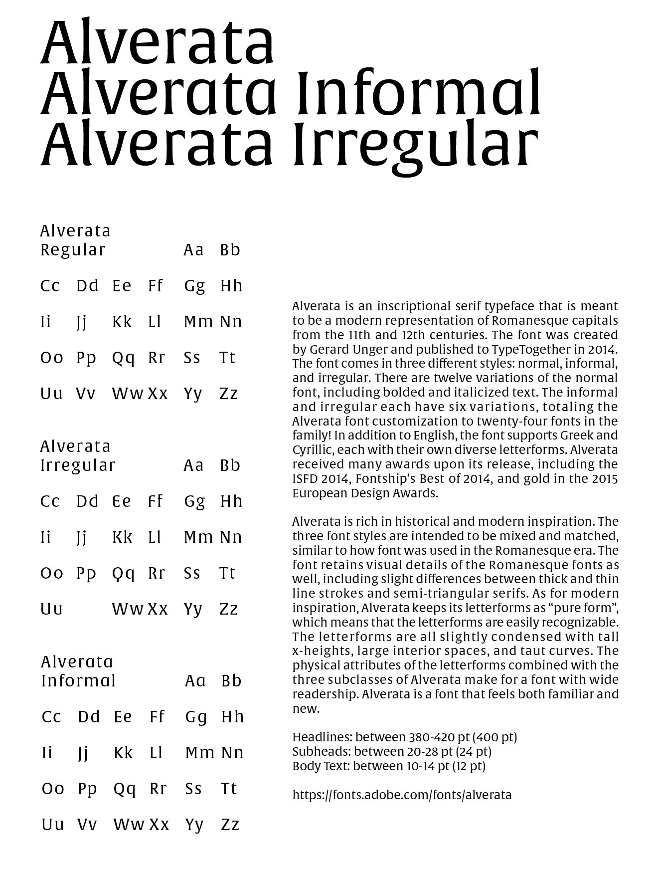
Information Document
v1.1
v1.2
v2.1
v2.2
v2.3
v2.4
v2.5
v2.6
v2.7
v2.8
v2.9
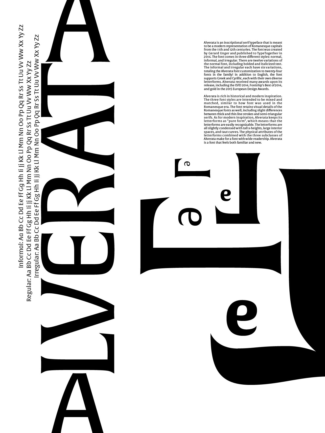
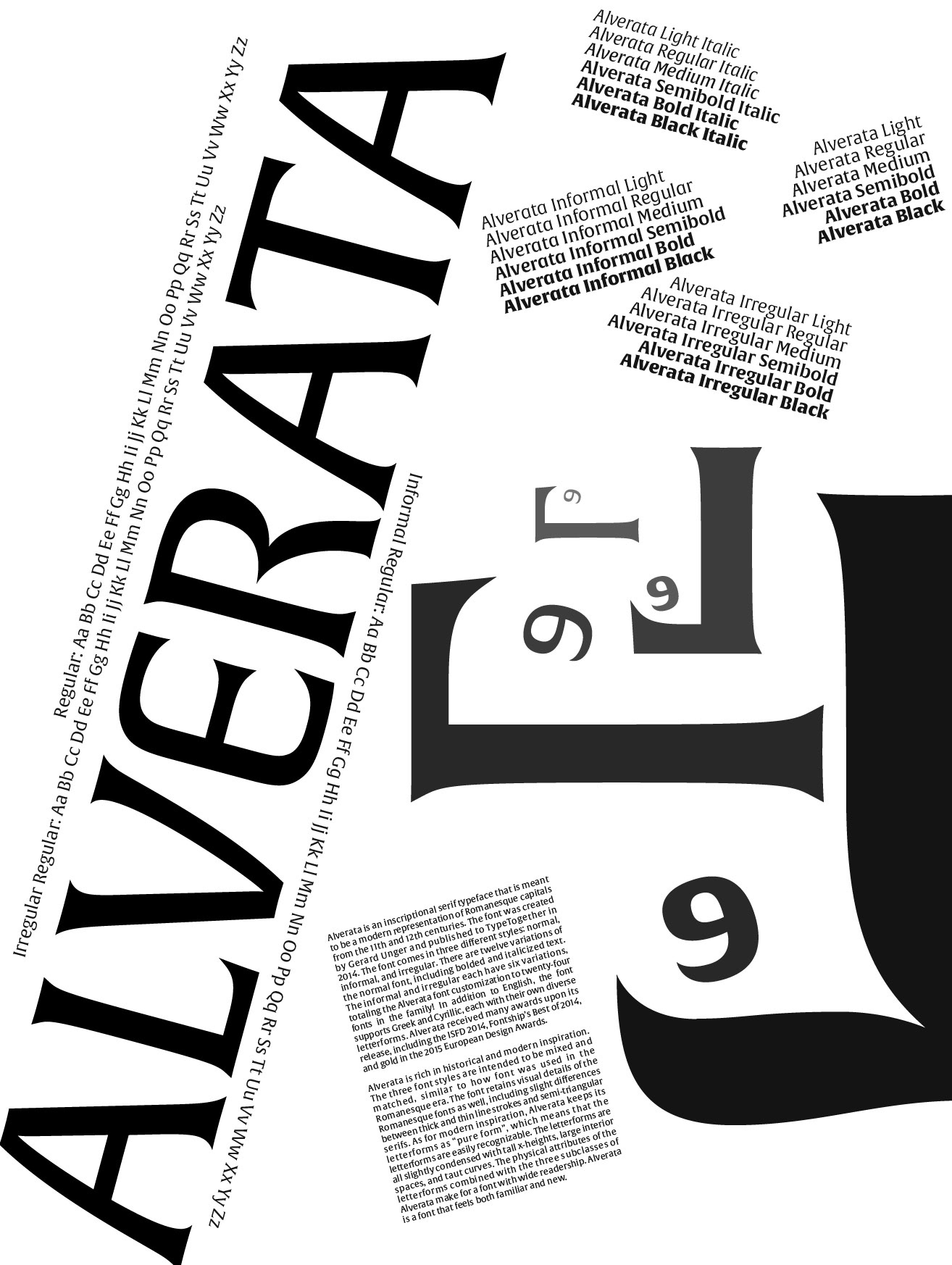
v3.1 (Final B&W)
v3.2
v3.3

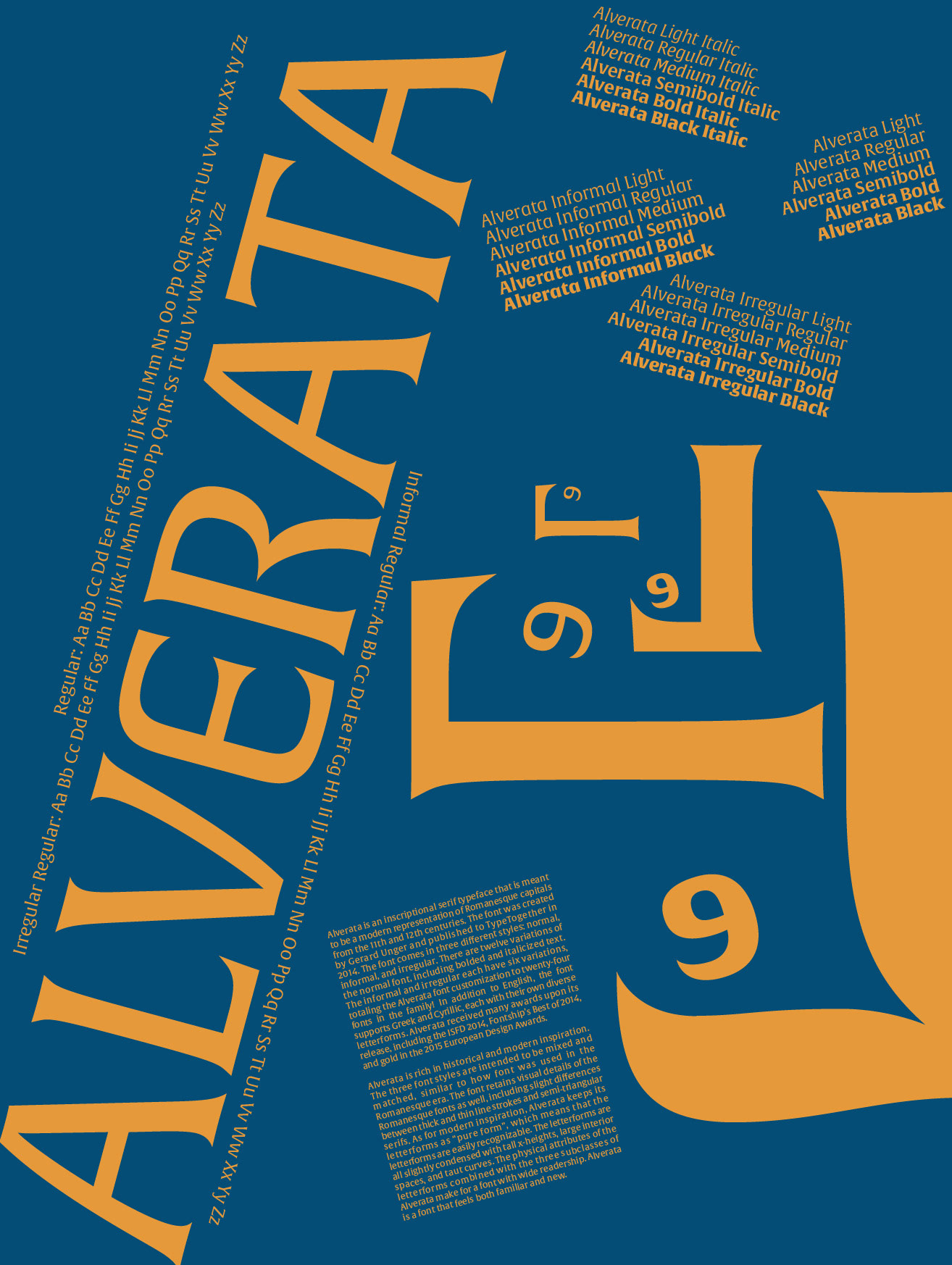
v3.4 (Final Color)
Illustrator Boards

Alverata
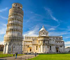
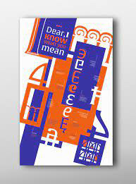
IMAGE Inspirations
Note: Numbers on images correlate with their citations in Credits tab.
(1)
(2)
(3)
(4)
(5)
(6)

(7)
(8)

(9)
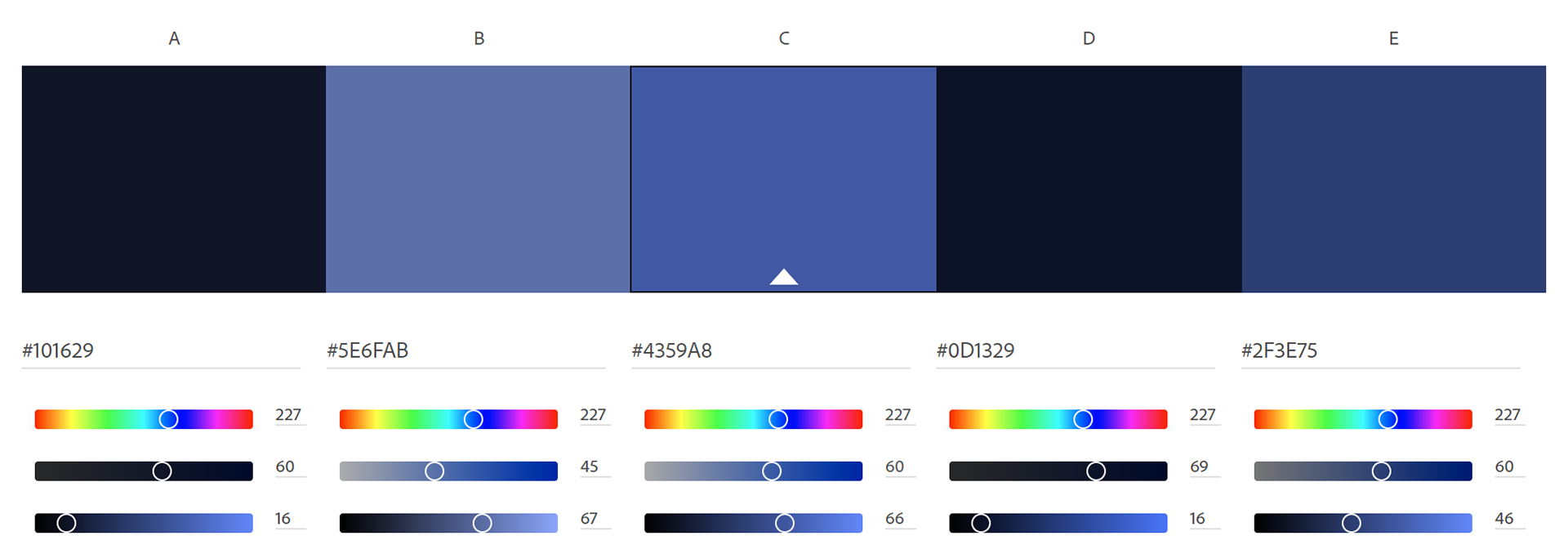
COLOR PALETTES

CLICK THE BLUE LINKS BELOW TO LEARN MORE ABOUT THIS PROJECT
EXPLORE MORE PROJECTS