


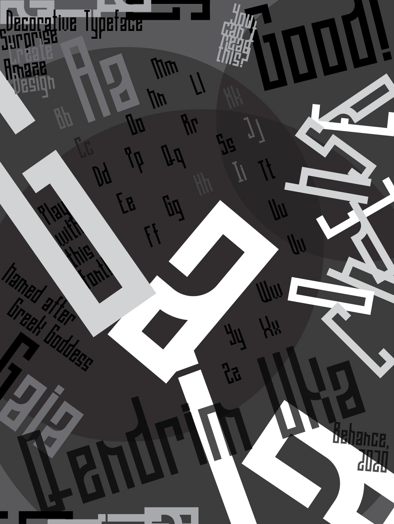
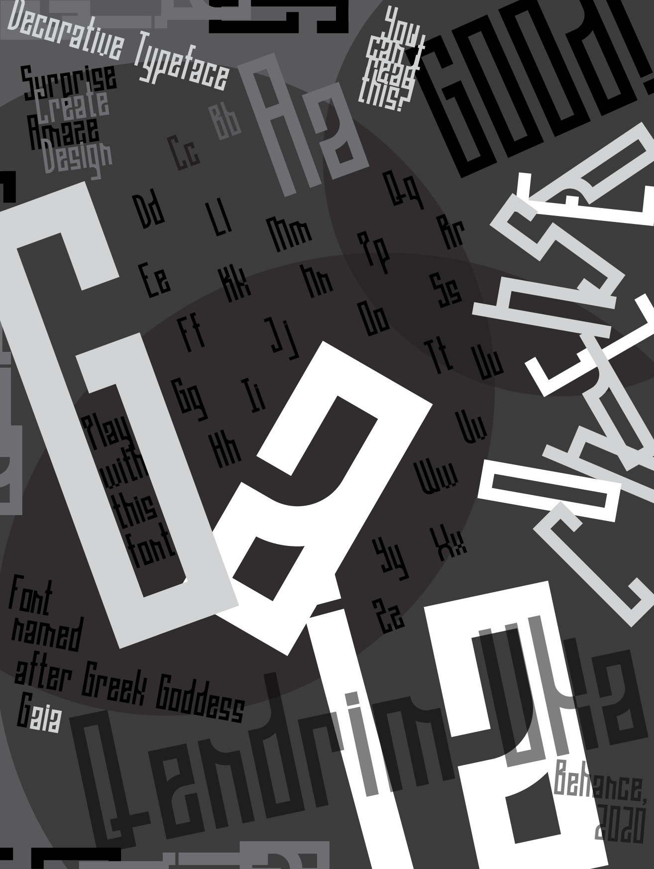
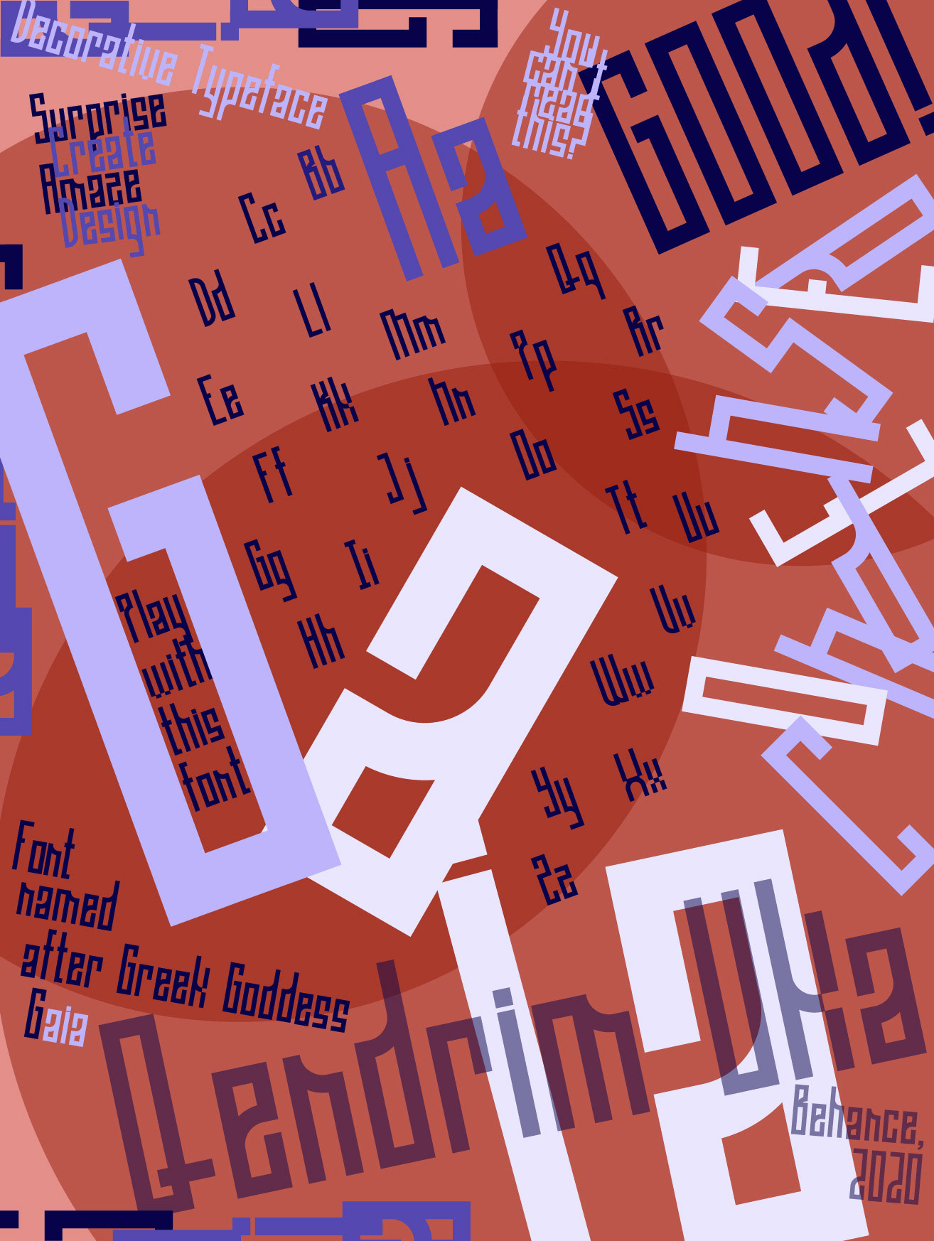
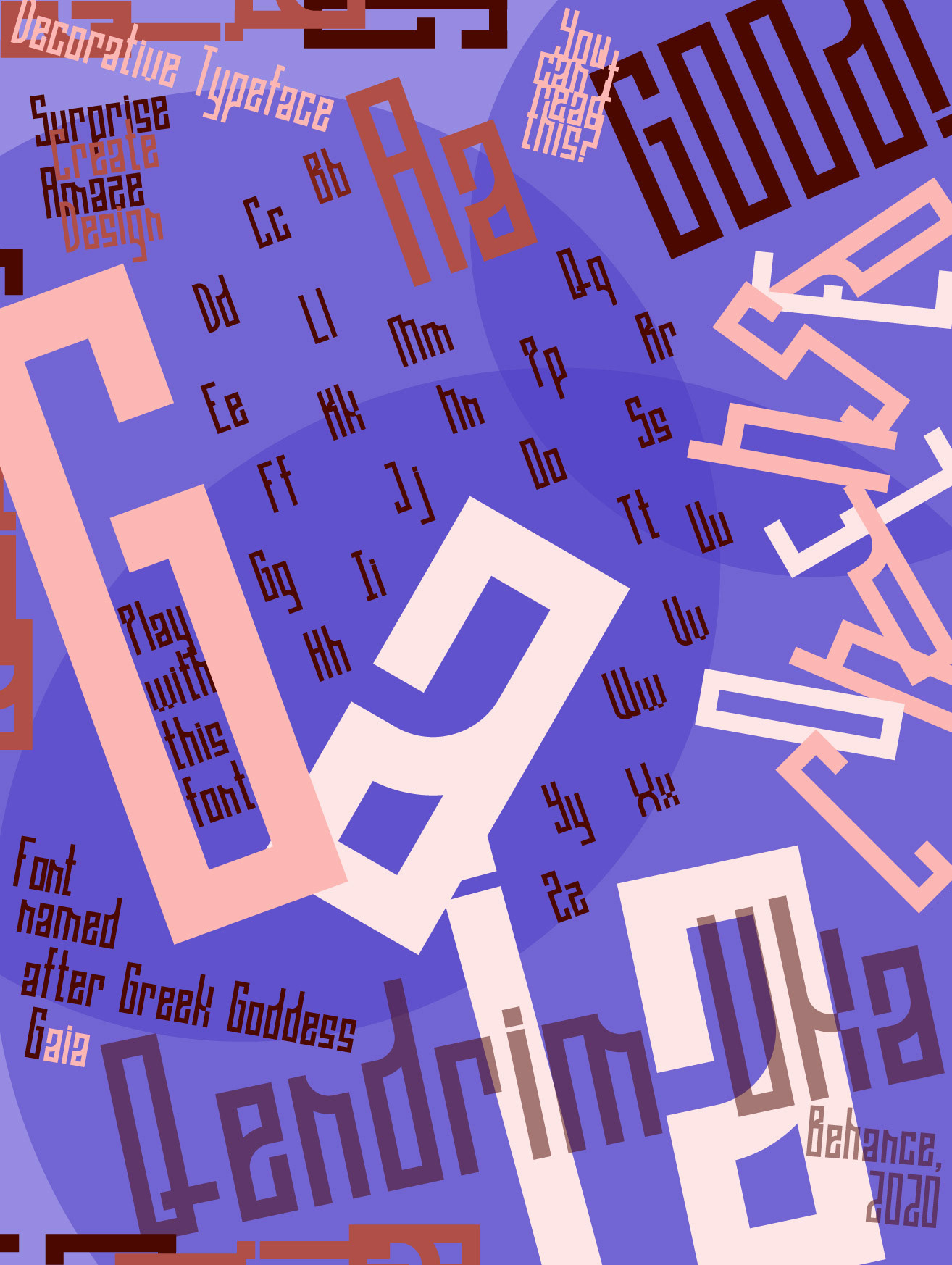
GAIA CONDENSED
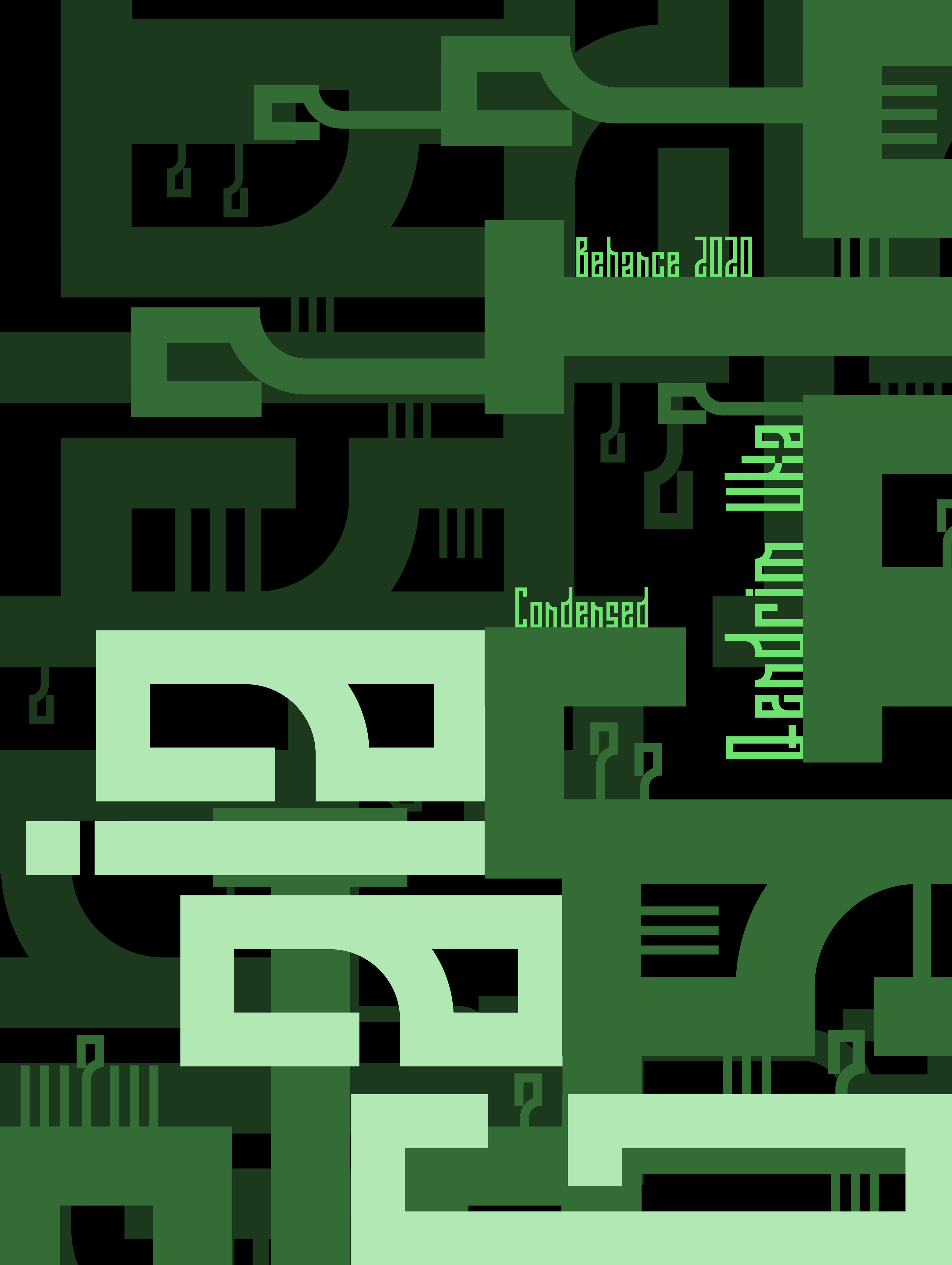
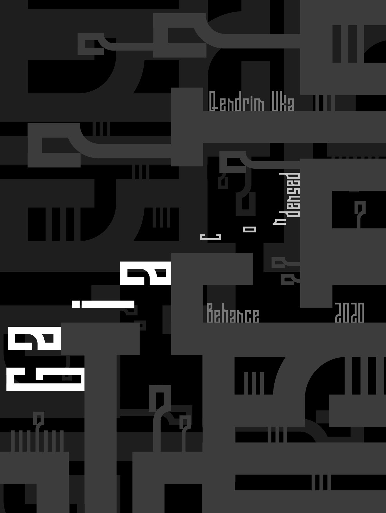
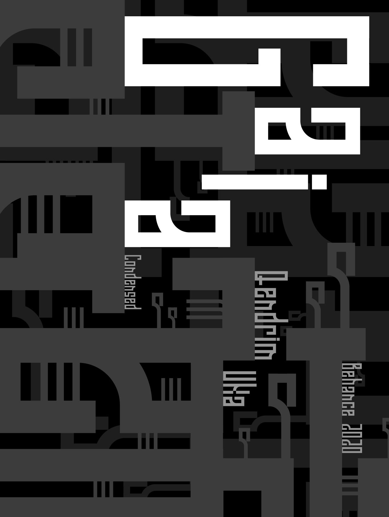
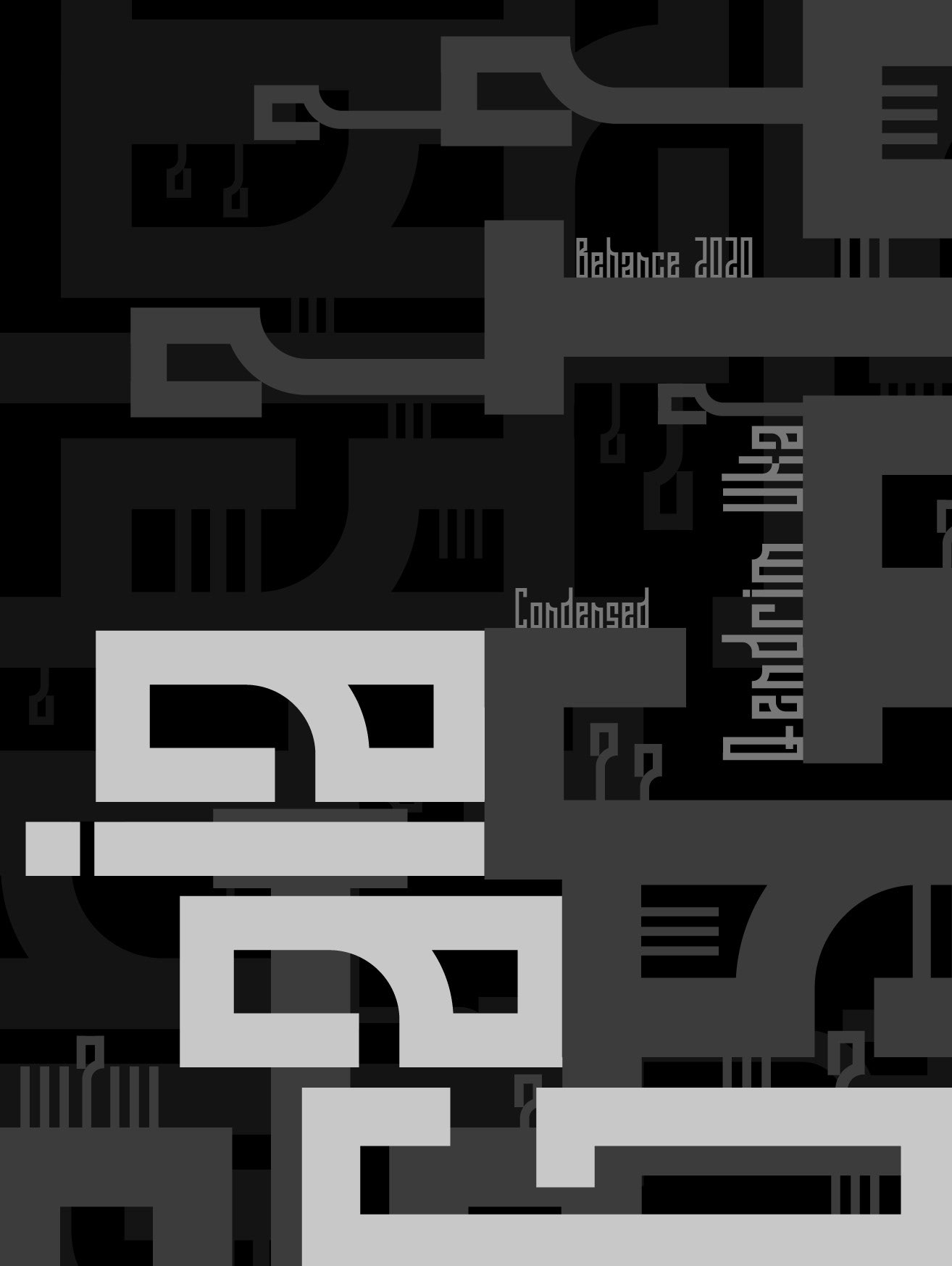
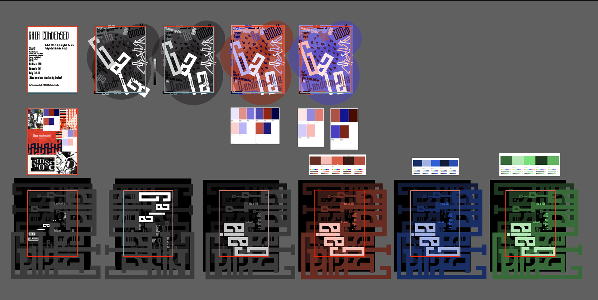
For "Gaia Condensed", I designed a more abstract type specimen poster. The font was designed to build artwork through the design of the letterforms, so I accomplished just that.
I initially encountered the same problem that I did with the "Slayer Movie" poster: too chaotic with a lack of cohesion. This time, however, I understood my mistake and redesigned the poster.
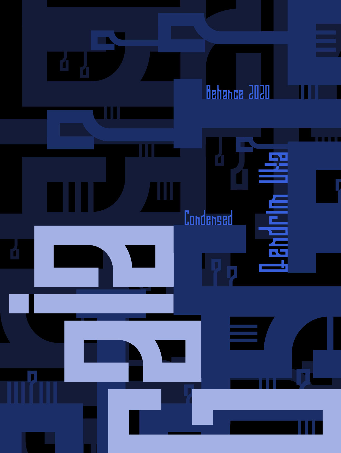
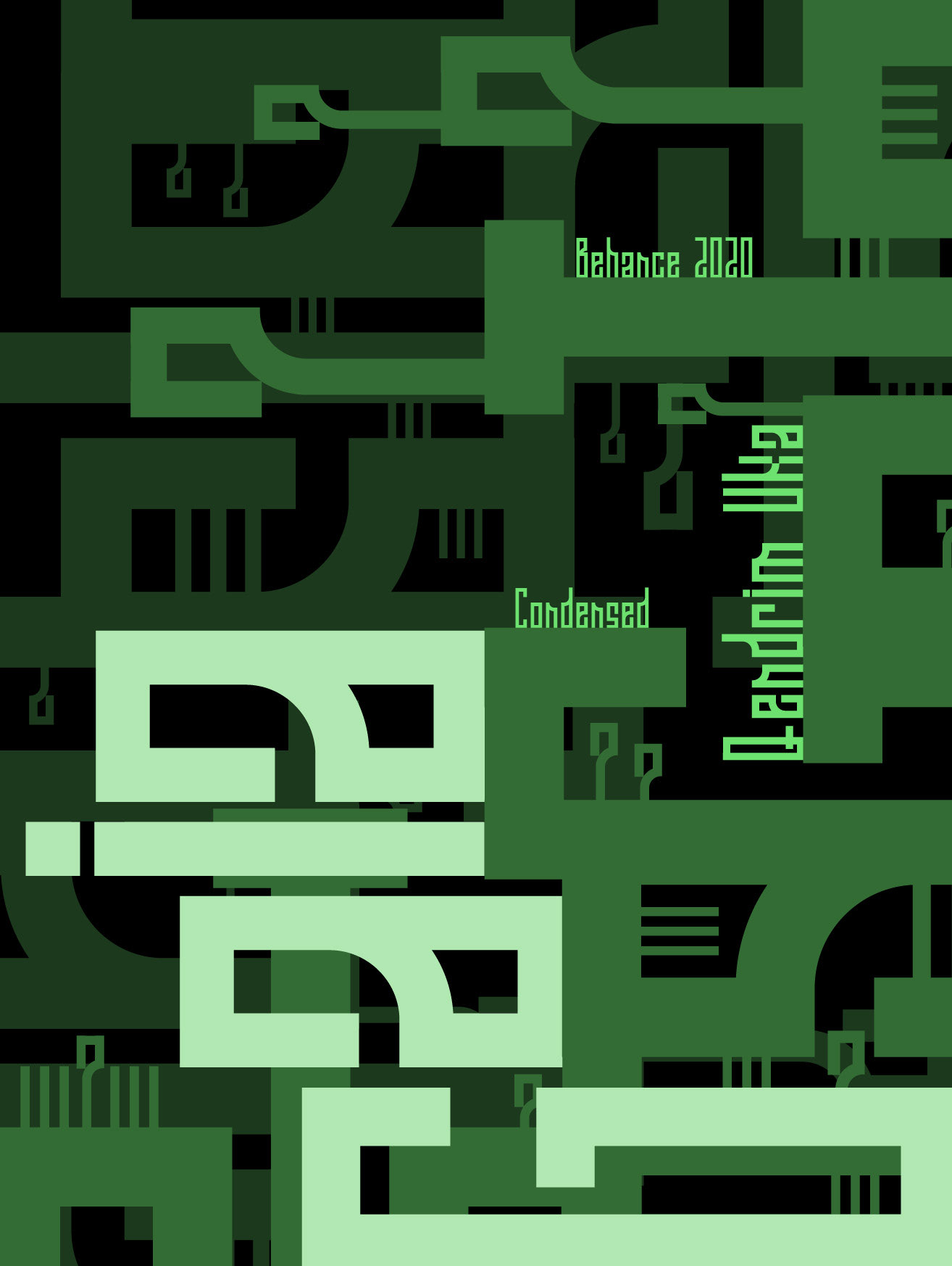
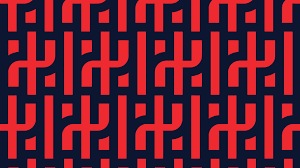
I leaned in heavily to the architectural designs of the letterforms. The letters looked artificial and digital, which I then associated with video game environments. I created iterations based on this approach and found satisfaction with the designs.
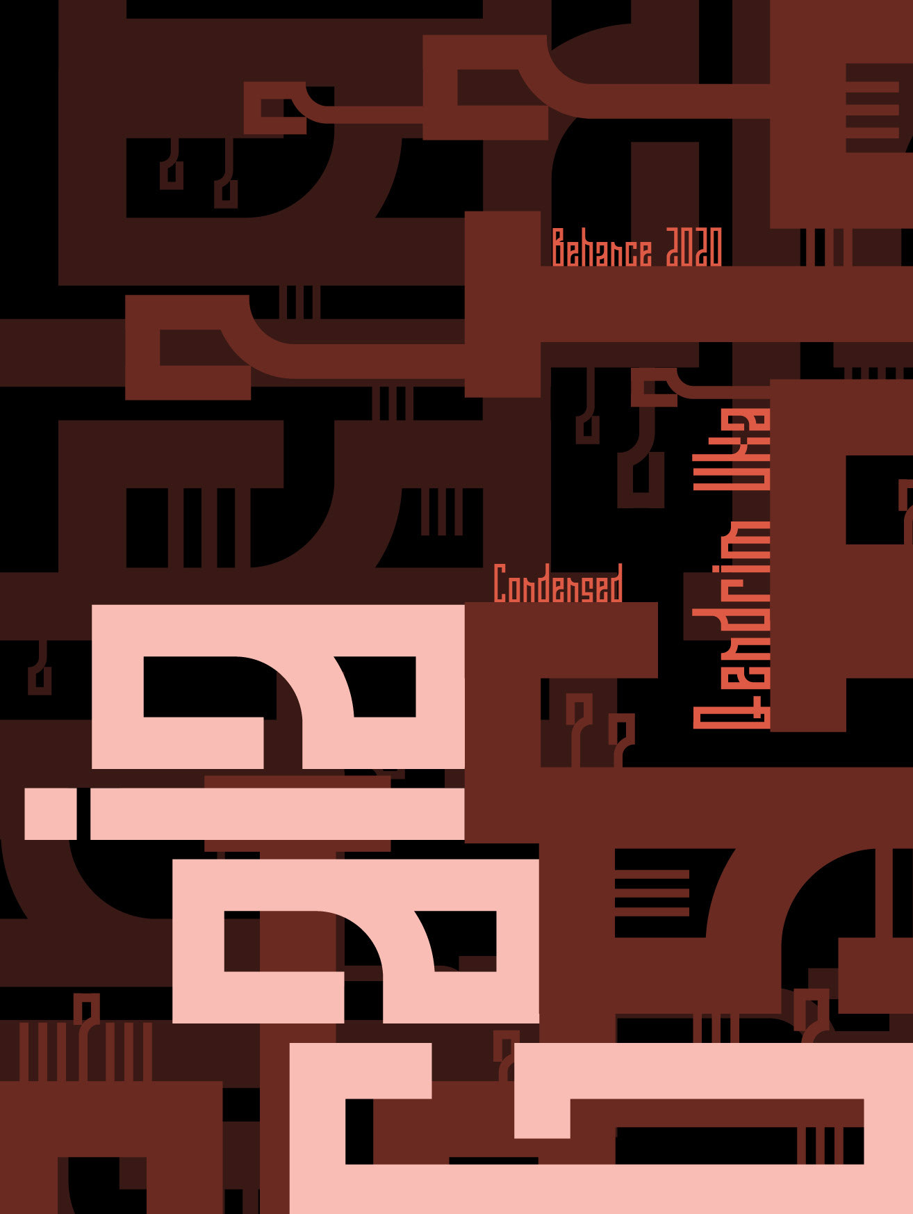
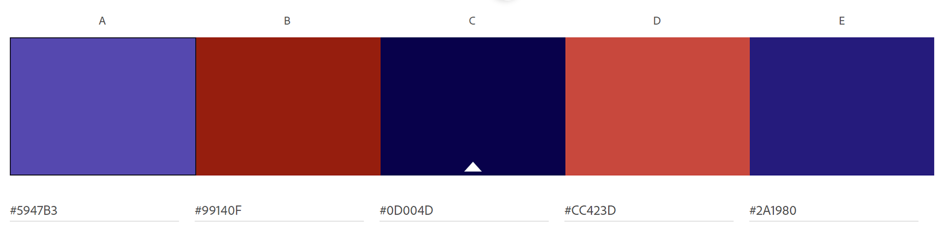
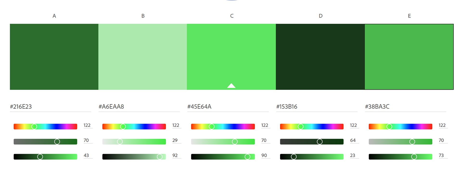
As for the colors, I drifted from the red and blue usually associated with "Gaia Condensed". Instead, I settled on green because the design resembled both a grassy landscape and a circuit board. Overall, this project taught me about organized chaos and abstraction in design.
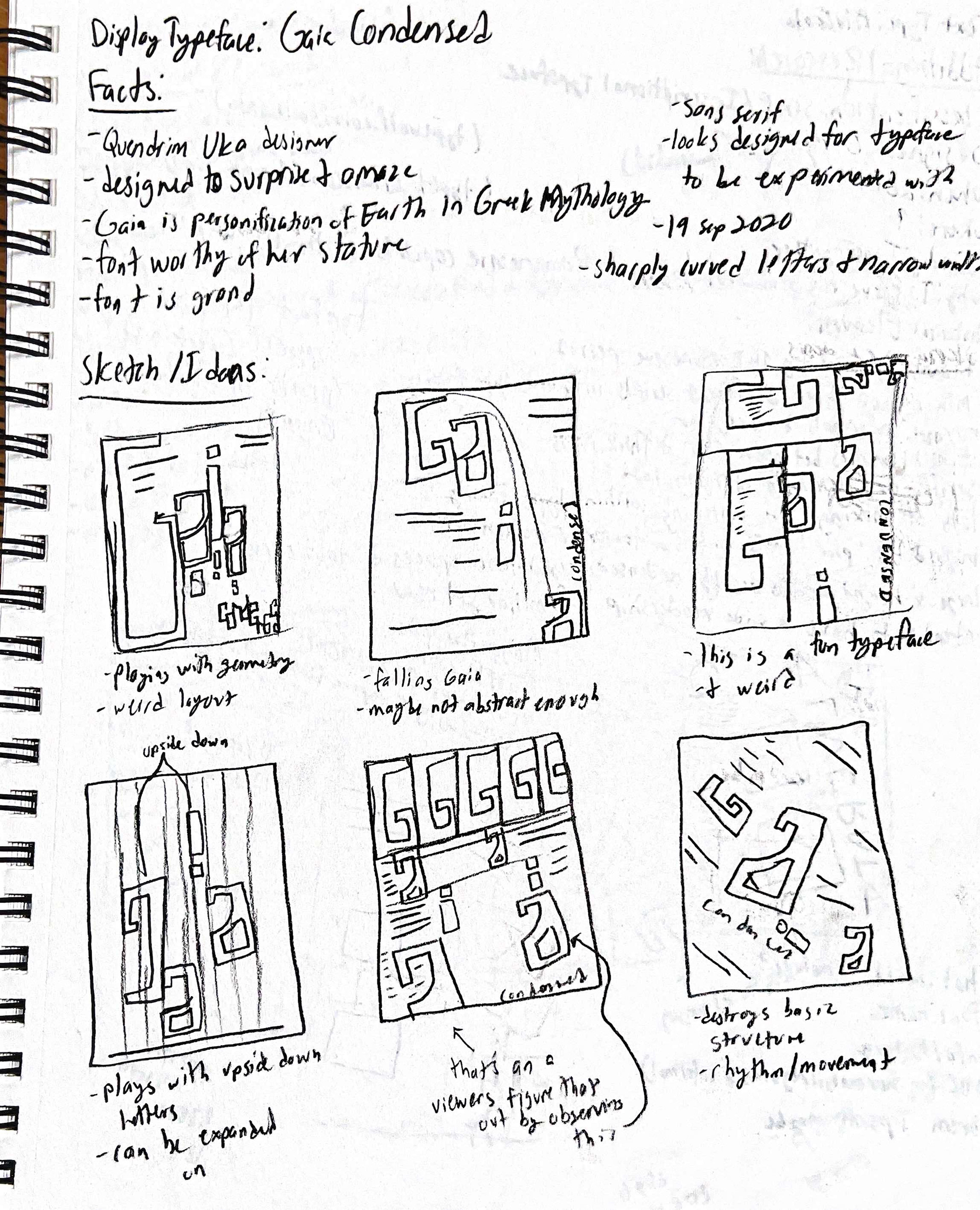
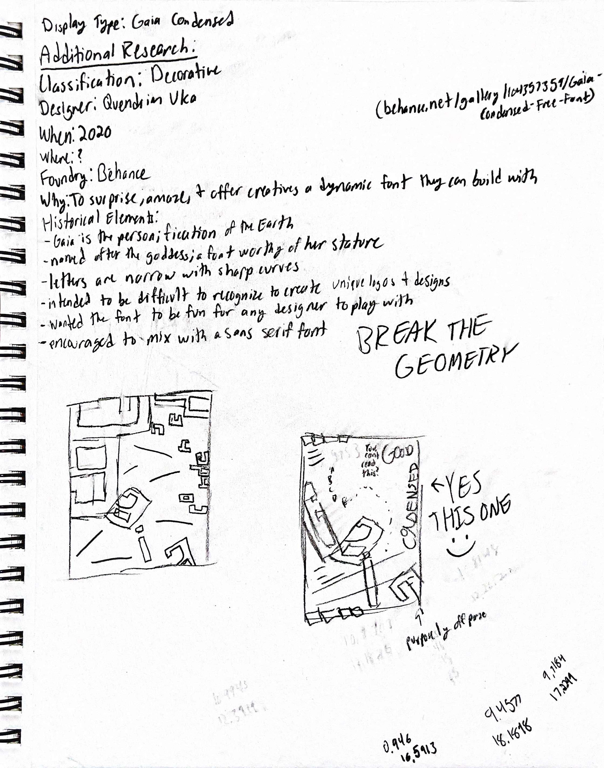
GAIA CONDENSED Paper Sketches / Research
GAIA condensed iterations
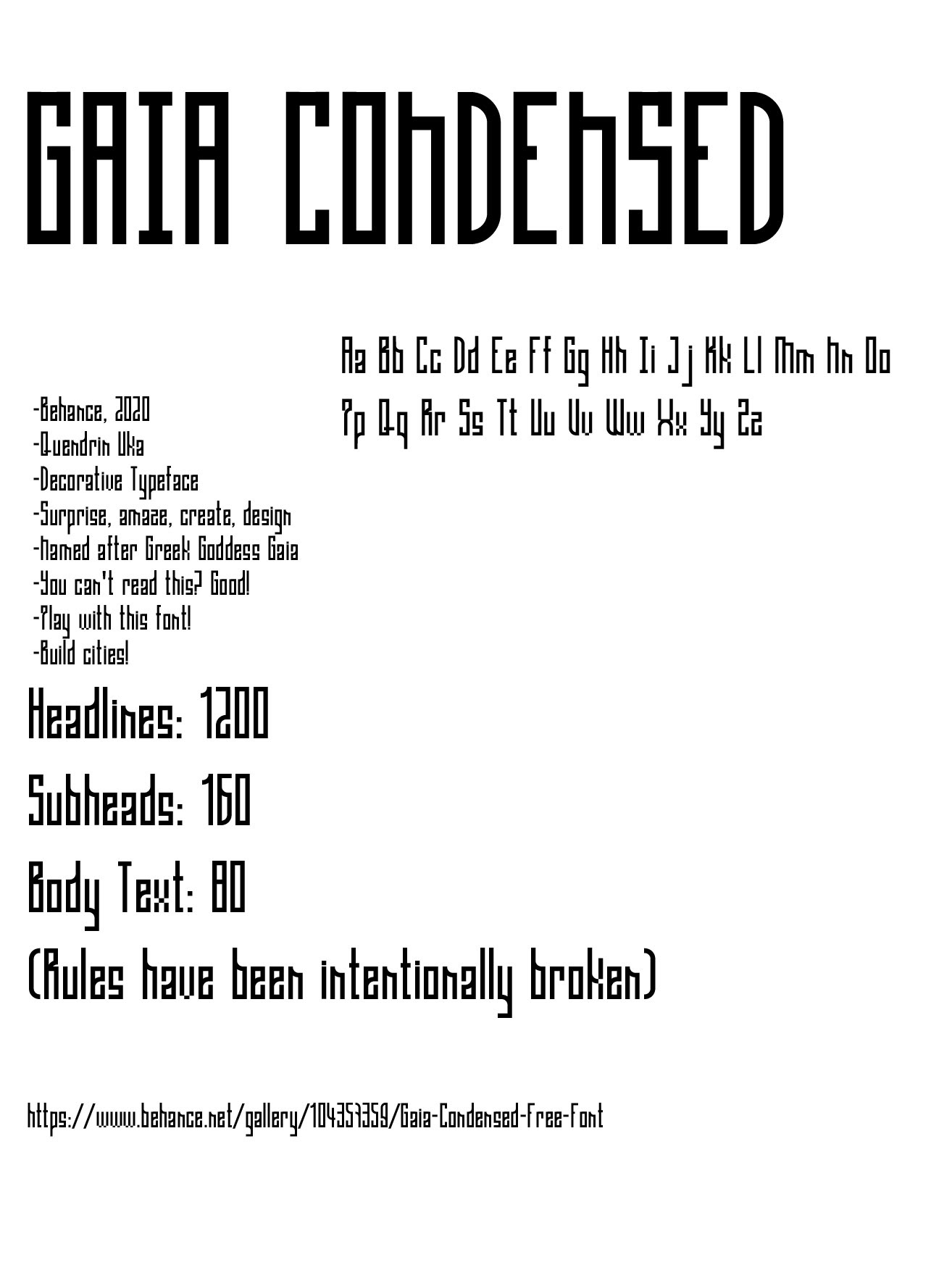
Information Document
v1.1
v1.2
v1.3
v1.4
v2.1
v2.2
v2.3 (Final B&W)
v2.4
v2.5
v2.5 (Final Color)
Illustrator Boards
Gaia Condensed
Image Inspirations
Note: Numbers on images correlate with their citations in Credits tab.
(10)
(11)
(12)

(13)
(14)

(15)
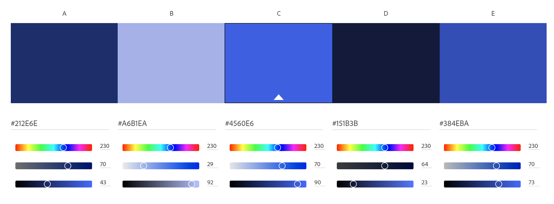
COLOR PALETTES
CLICK THE BLUE LINKS BELOW TO LEARN MORE ABOUT THIS PROJECT
EXPLORE MORE PROJECTS