


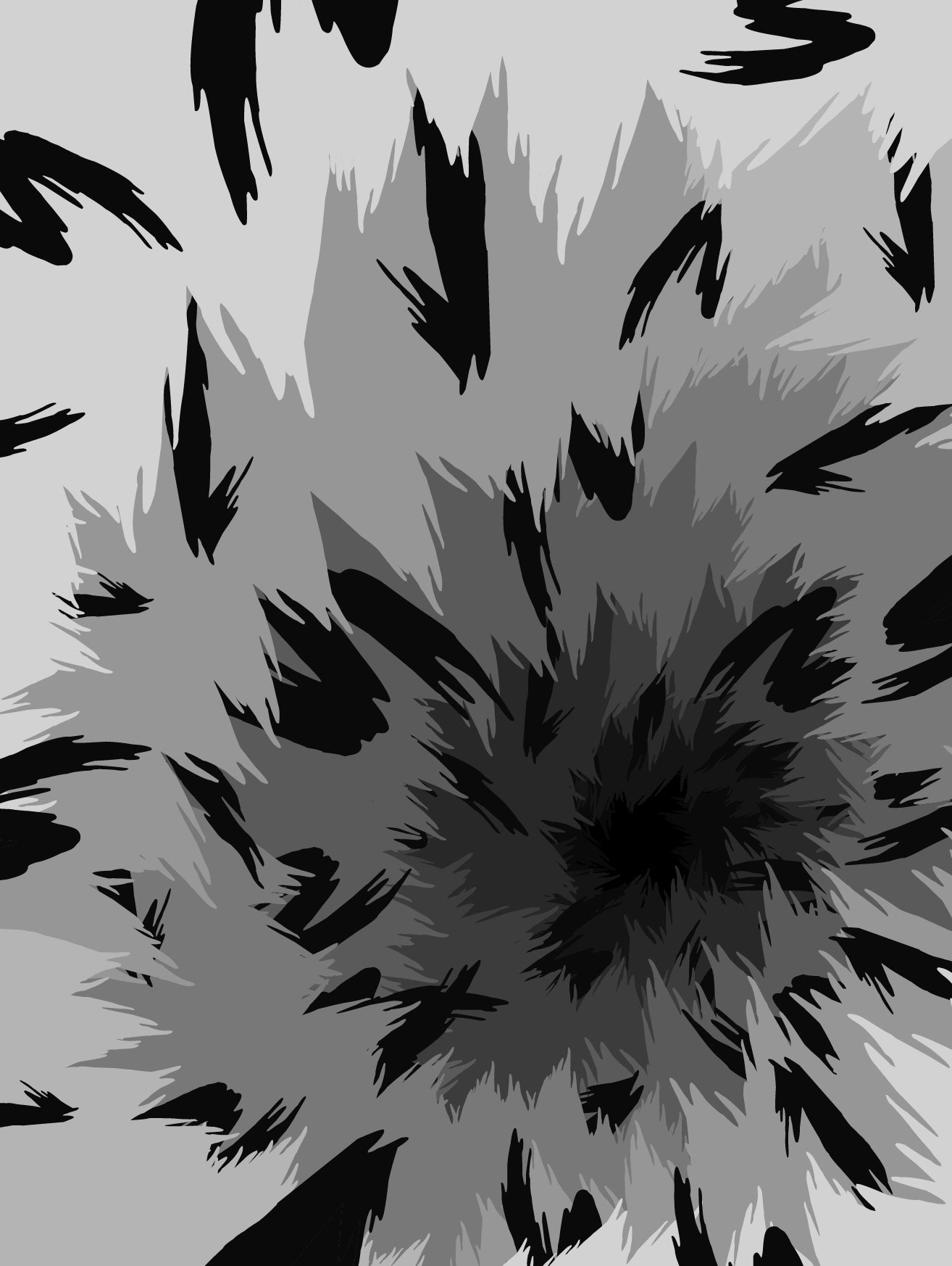
Slayer Movie
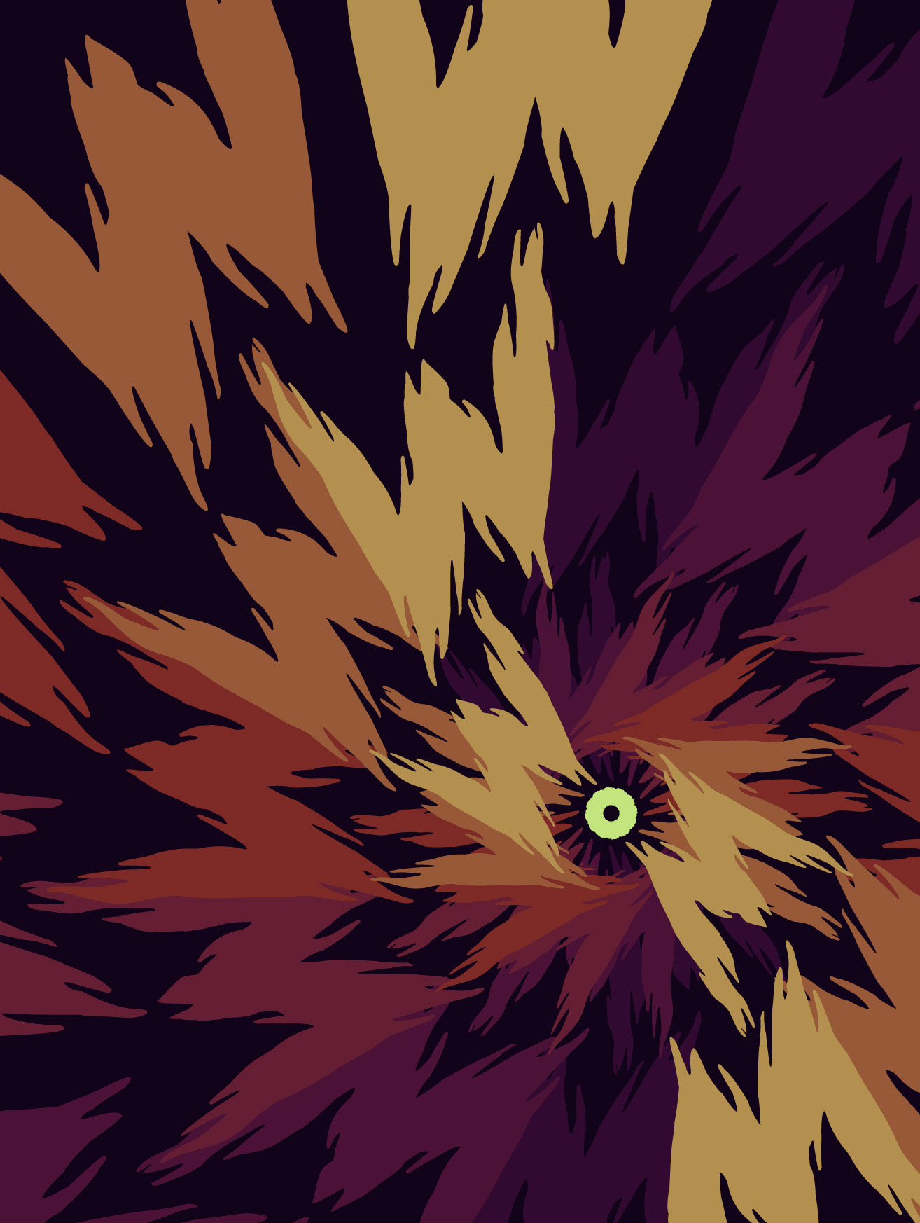
For "Slayer Movie", I designed a poster around the letterforms themselves. I wanted to represent the uneasy tone the font gave off and create a poster with my likeness.
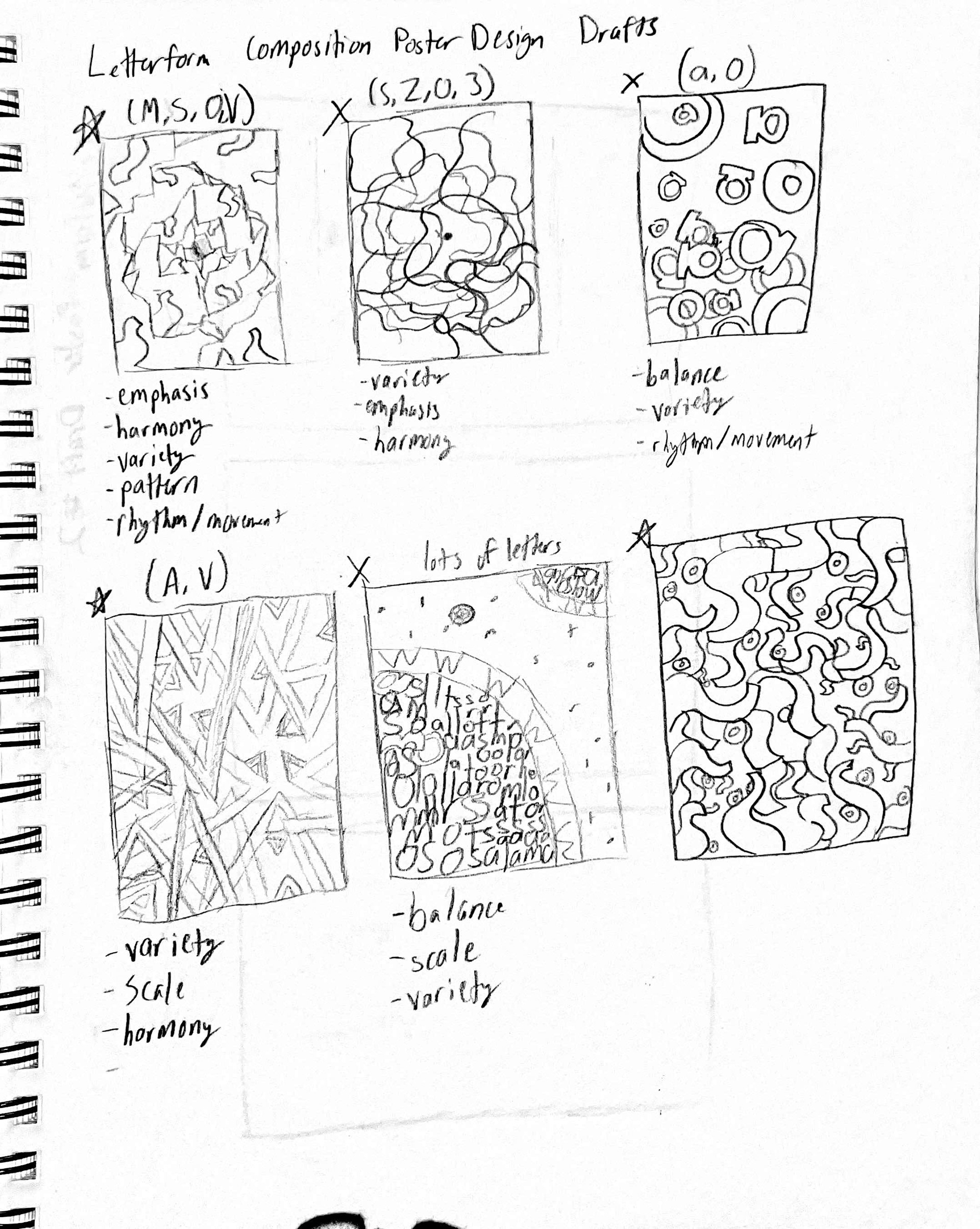
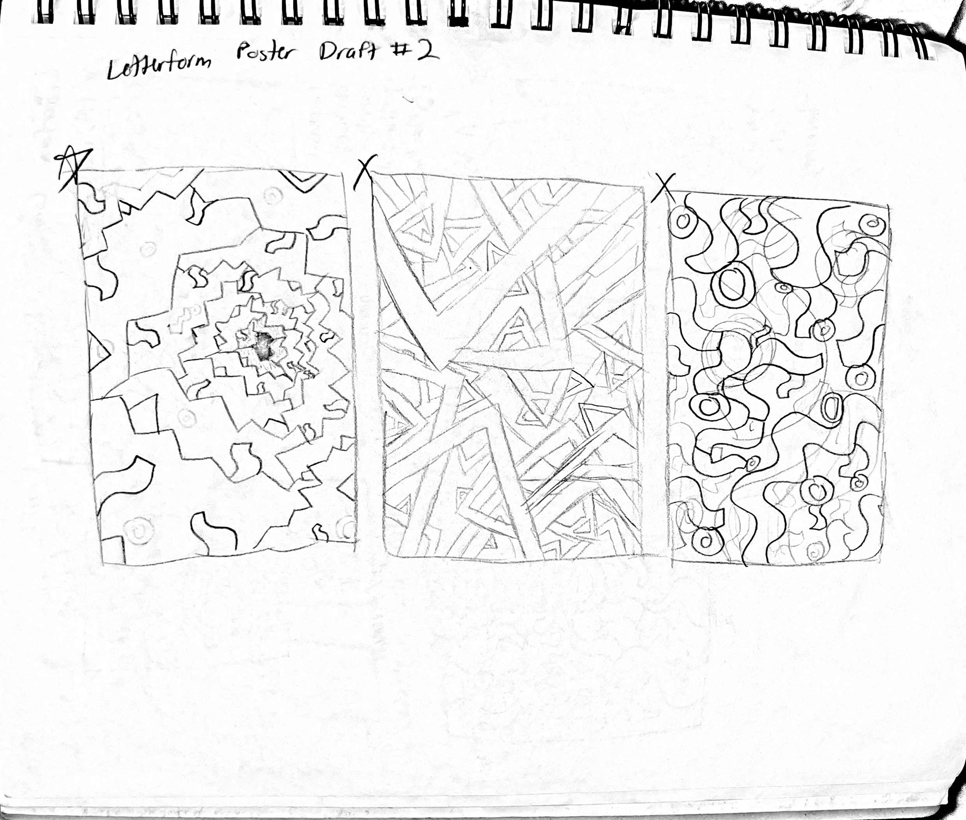
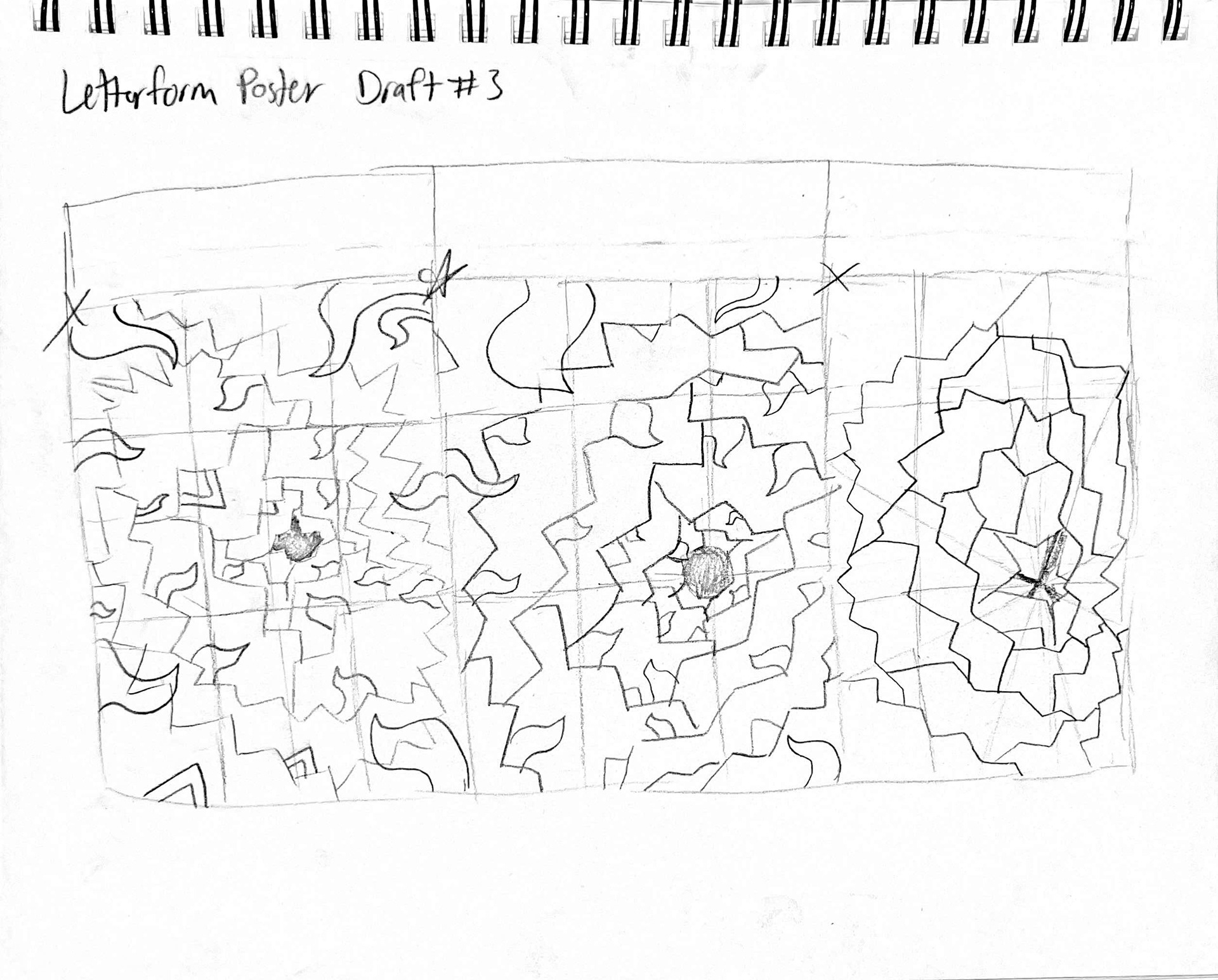
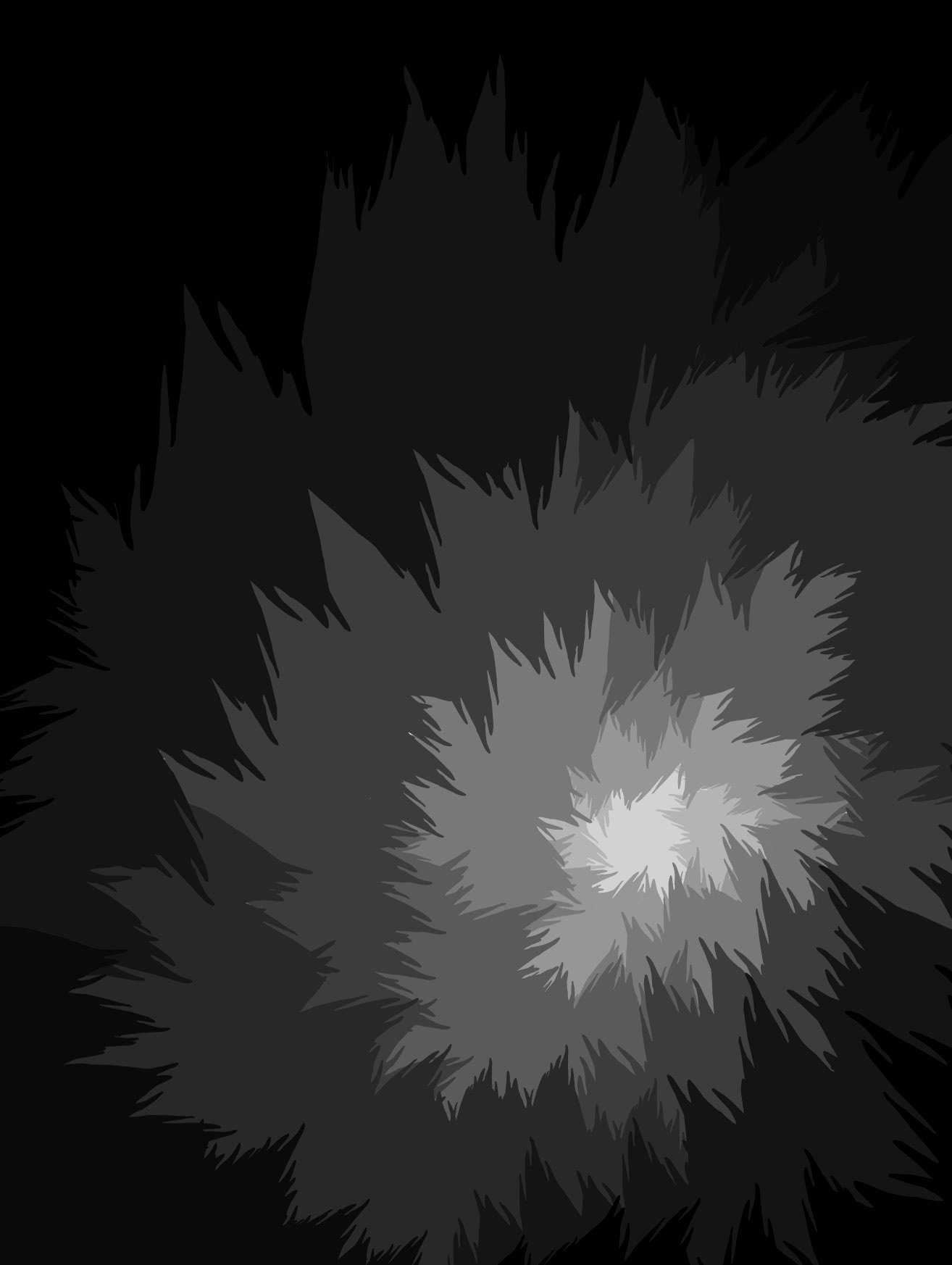
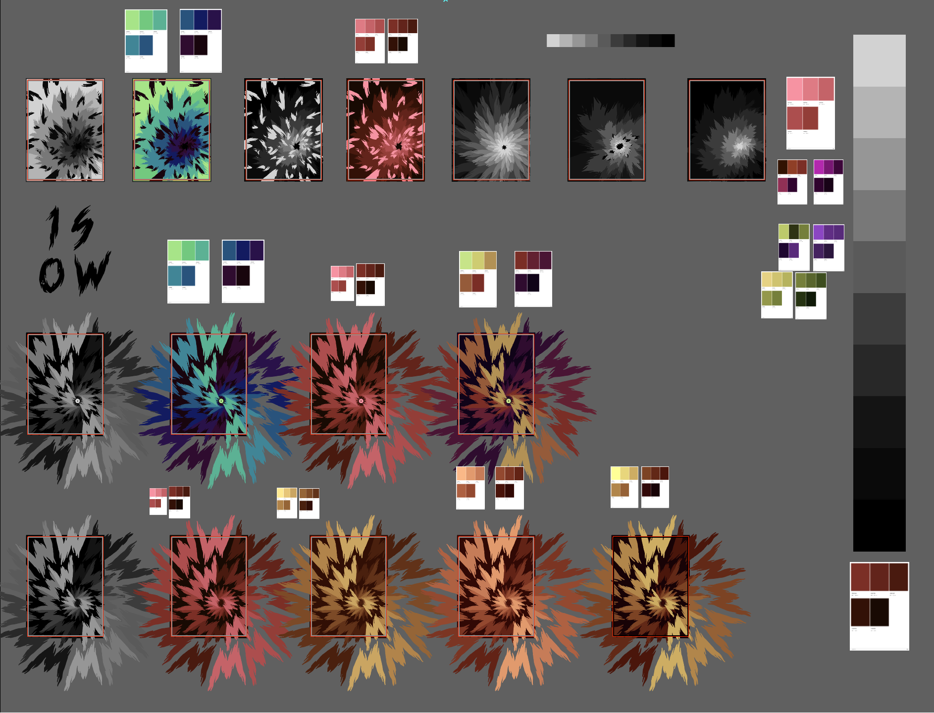
Initially, I admittedly struggled with the design aspect of the project. My initial iterations were random and chaotic; and they lacked the cohesion to provide a strong design. Despite this, I stuck with my original idea of a focal point.
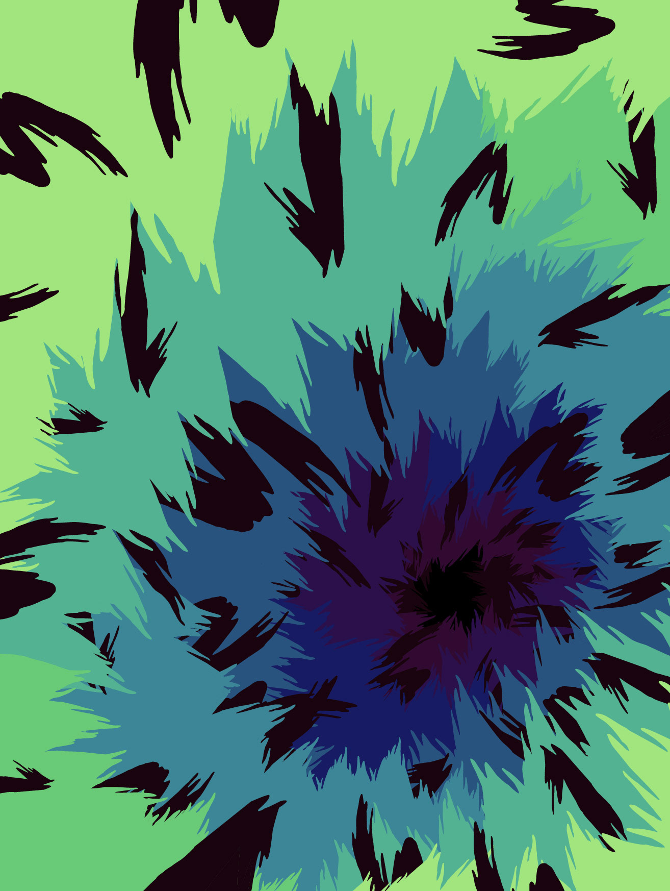
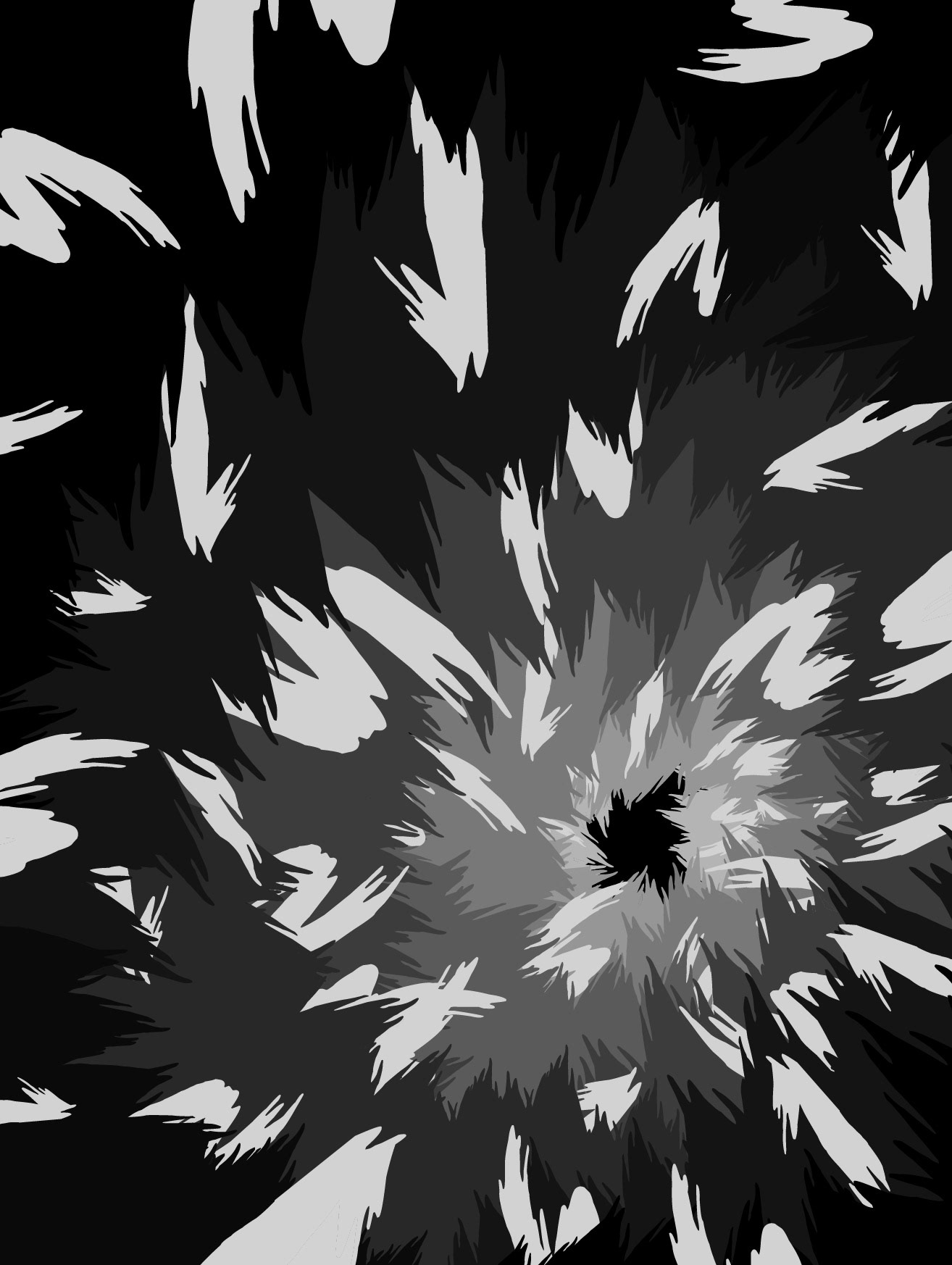
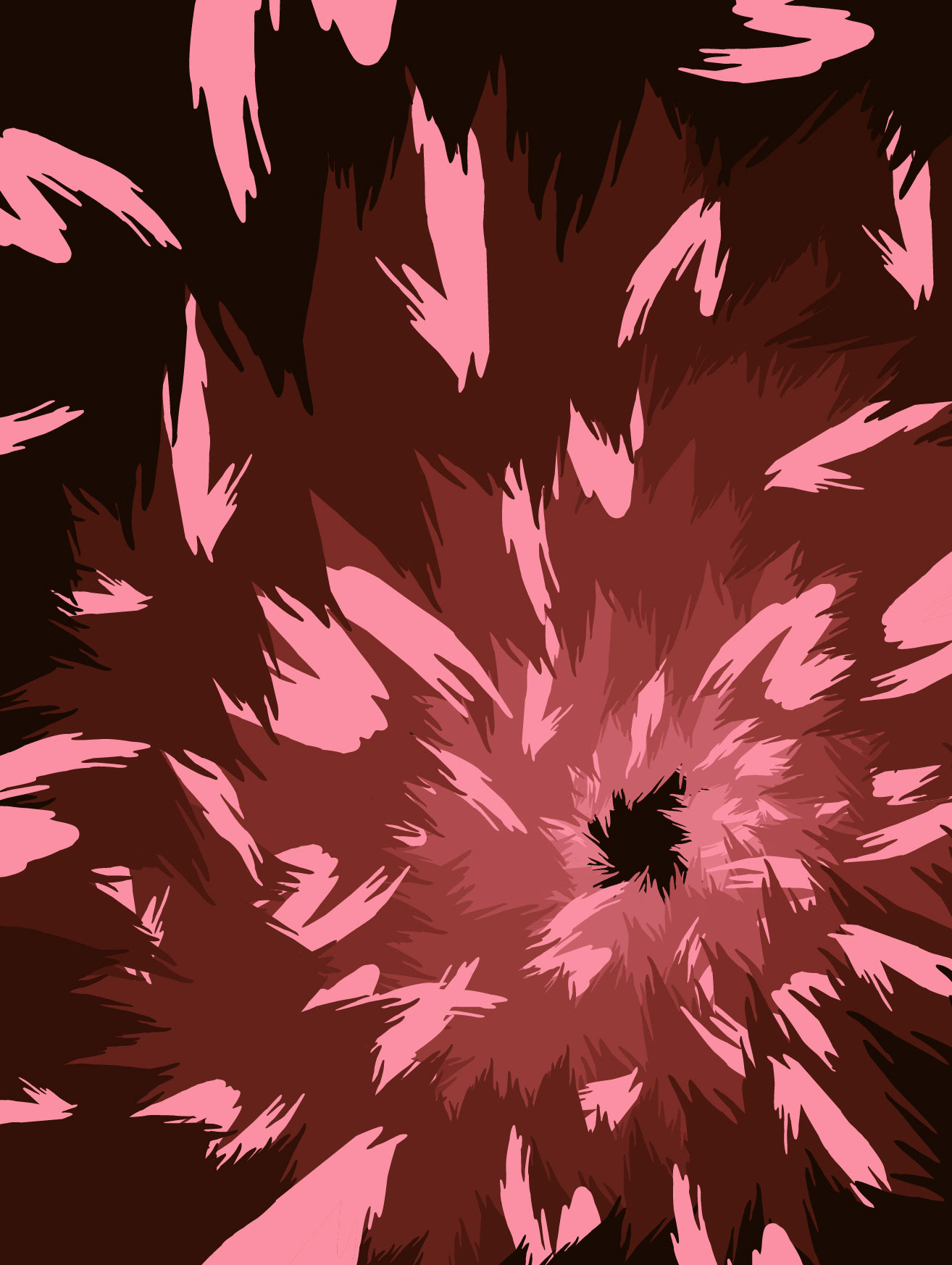
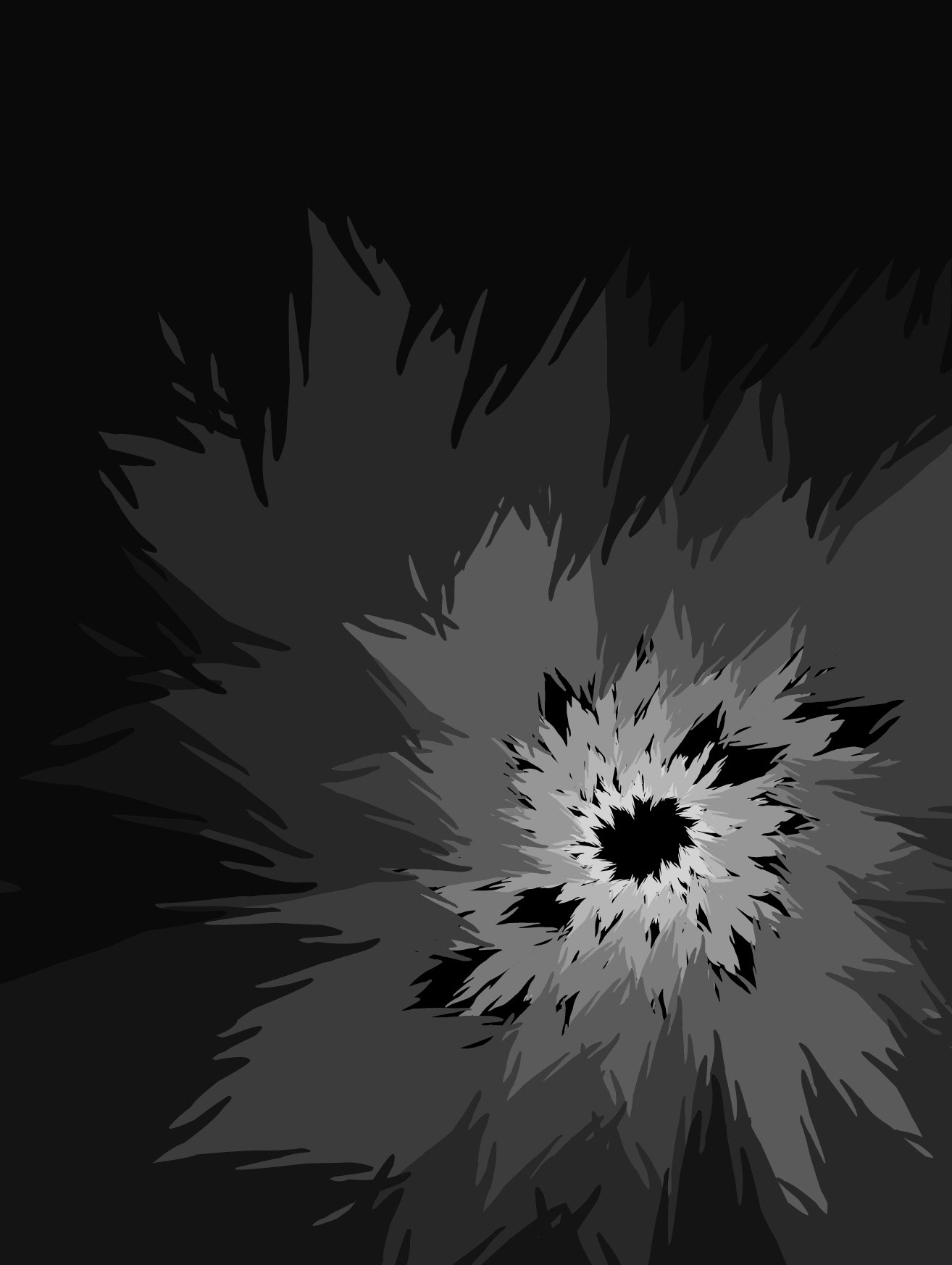
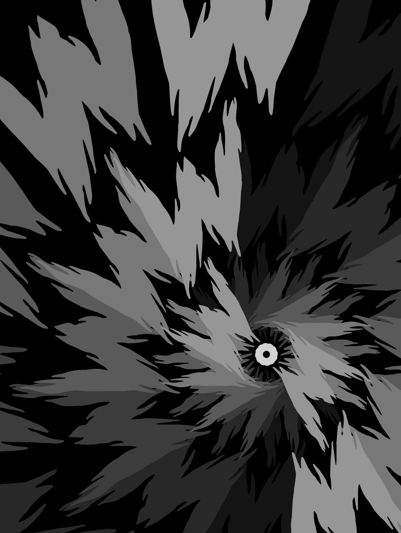
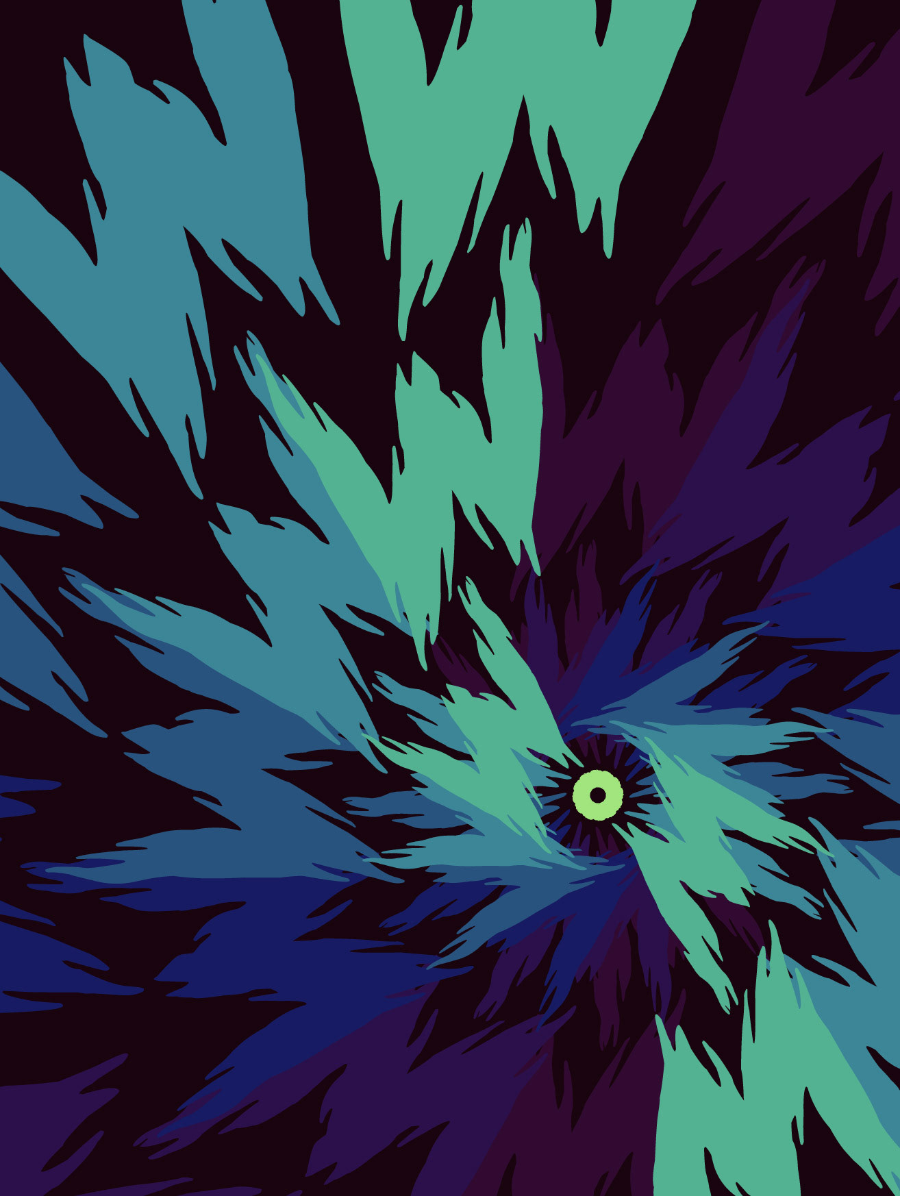
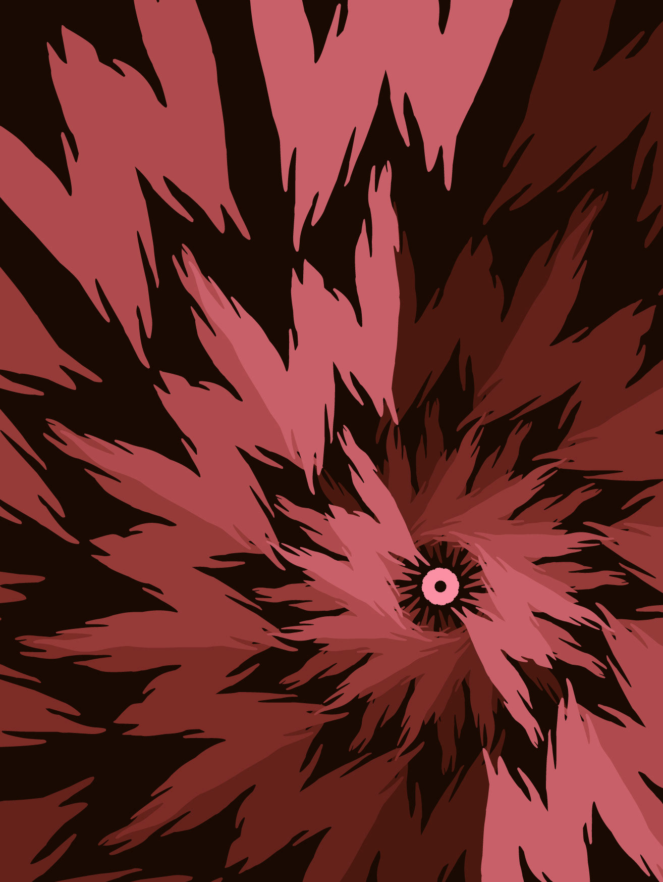
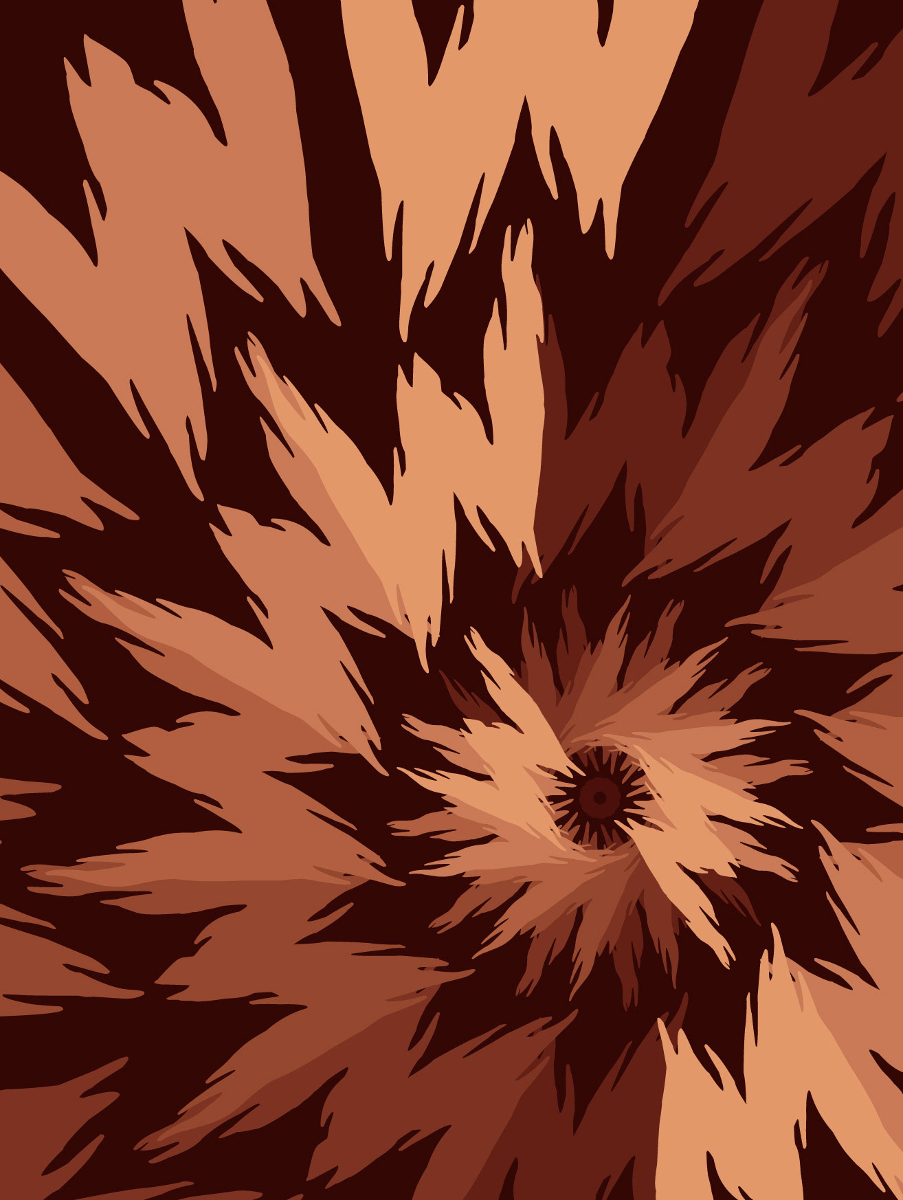
The letterforms for "W" looked as if they were moving, so I settled on a spiral-based poster for the design. I experimented with various designs before I settled on a cyclone I preferred.
Overall, I feel that this project taught me crucial lessons about design as a whole; and I now consider the elements of design with every piece I create.
Slayer mOvie Paper Sketches
SLAYER MOVIE iterations
v1.1
v1.2
v1.3
v1.4

v2.1
v2.2
v2.3
v3.1
v3.2
v3.3
v3.4

v4.1 (Final B&W)

v4.2

v4.3
v4.4
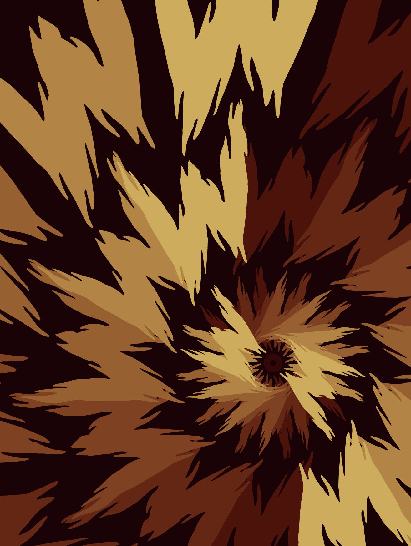
v4.5 (Final Color)
Illustrator Boards
Slayer Movie
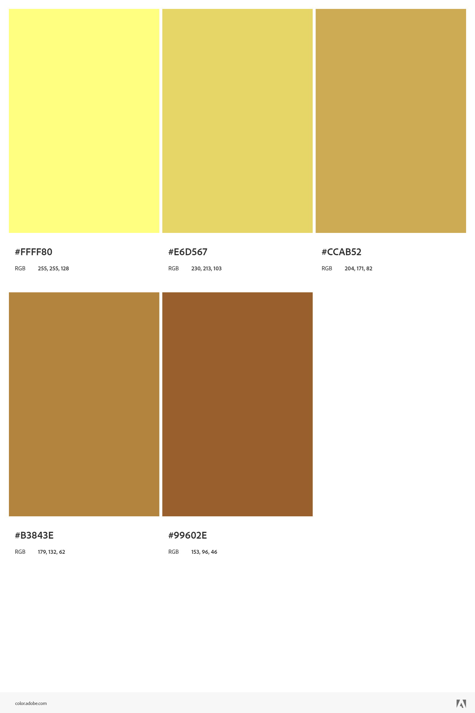
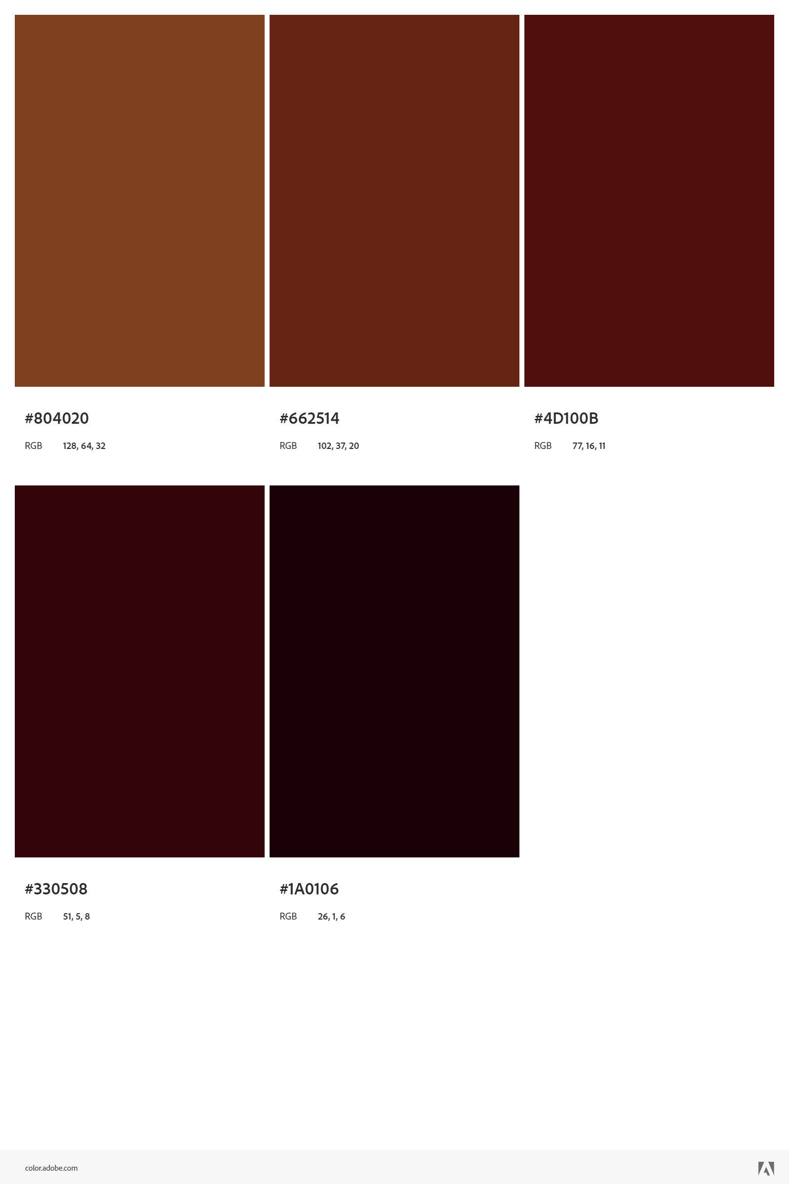
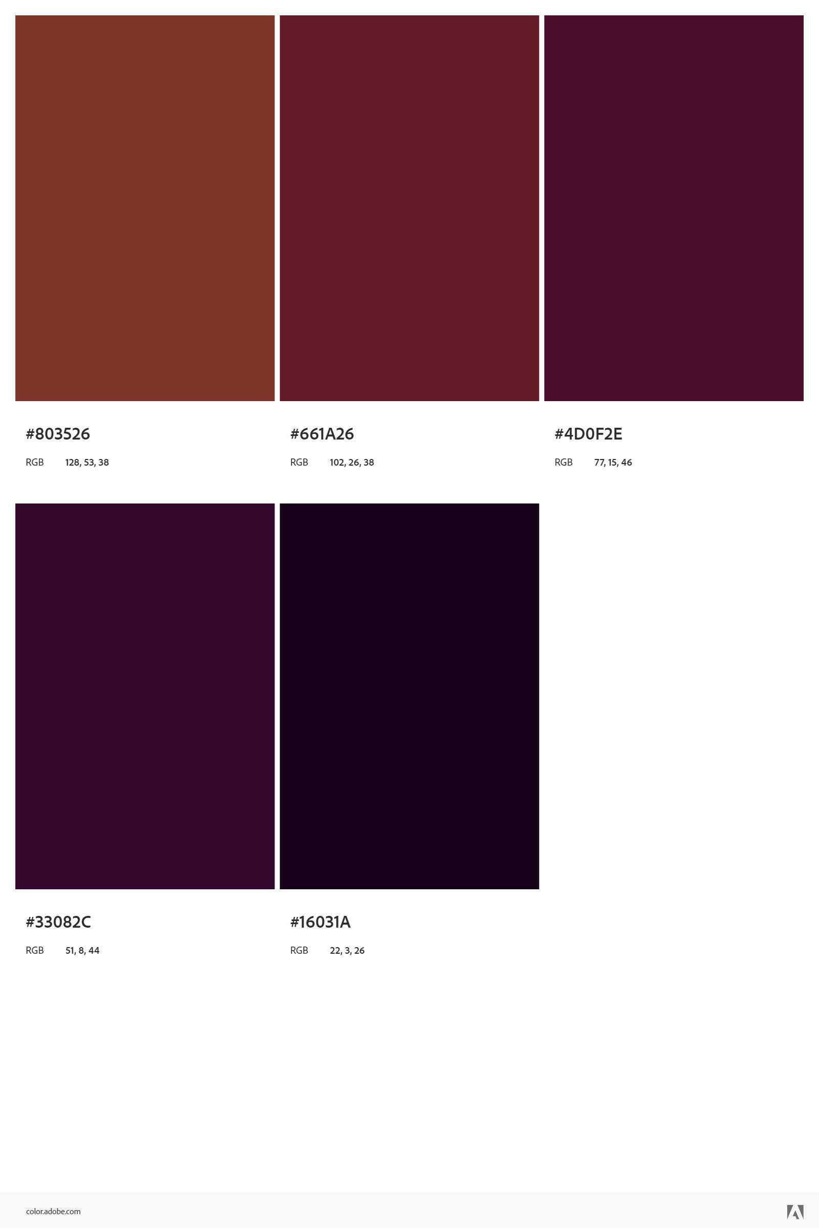
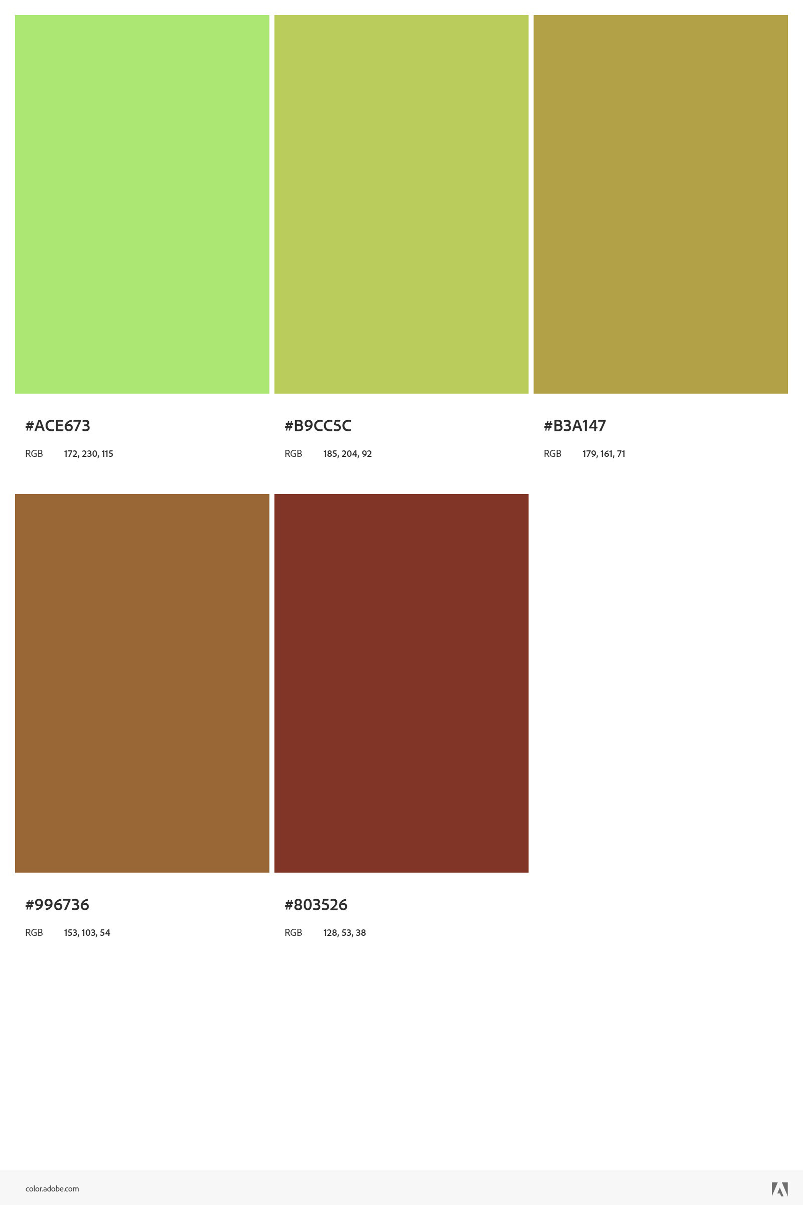
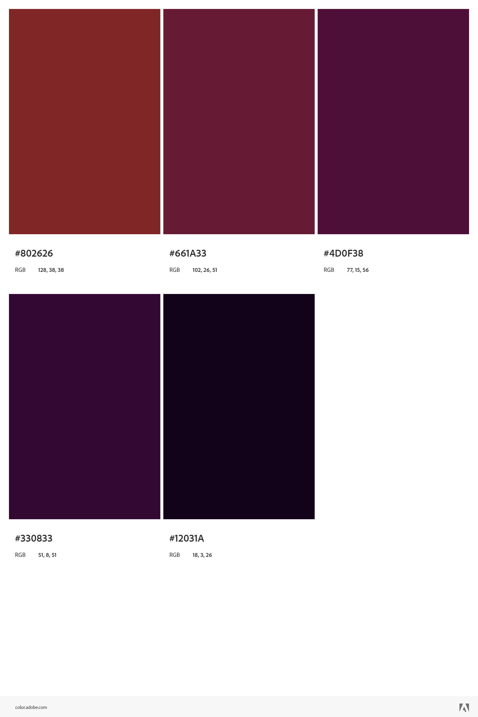
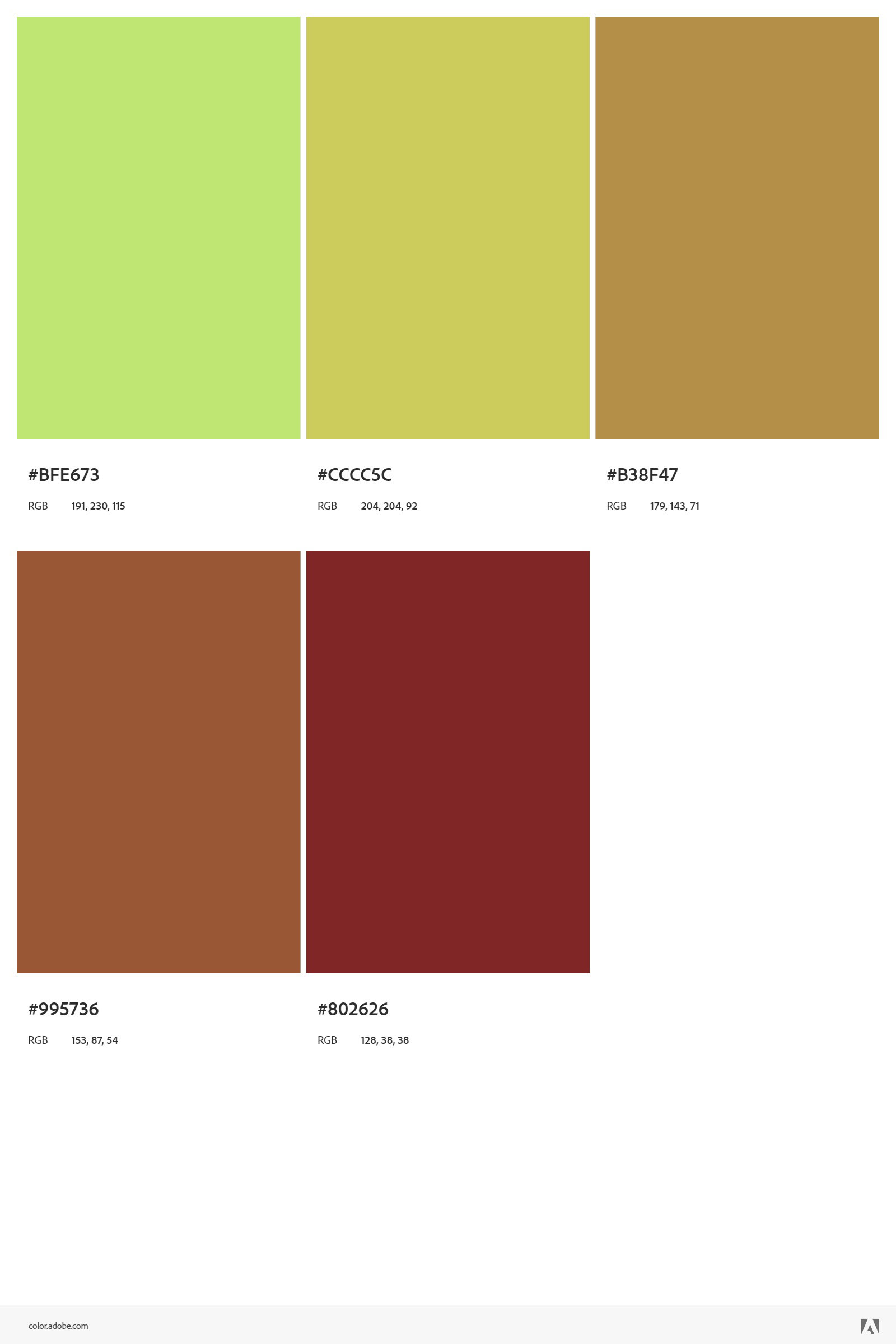
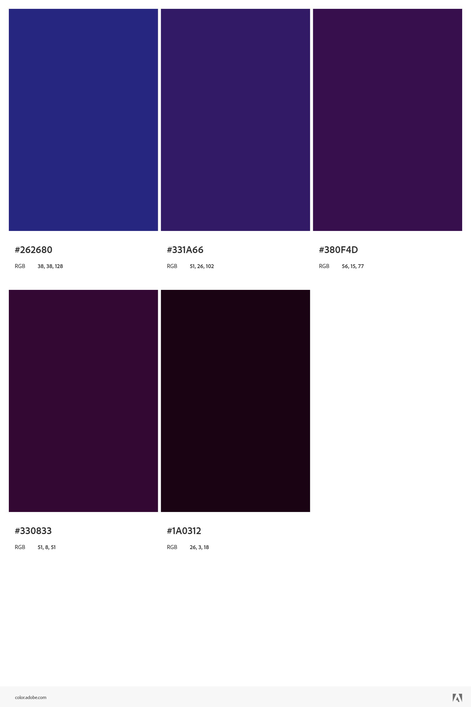
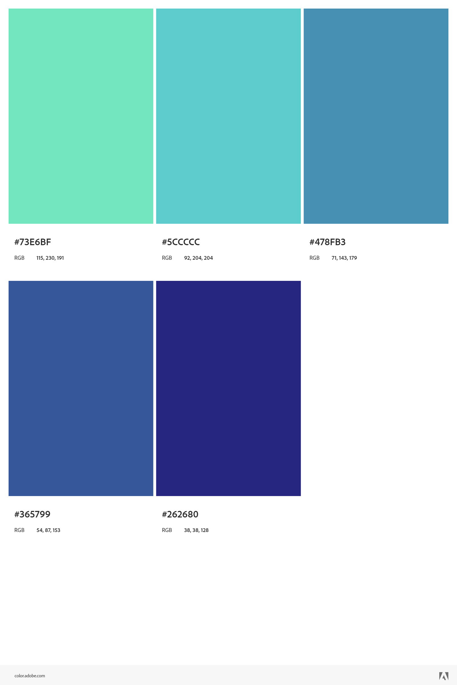
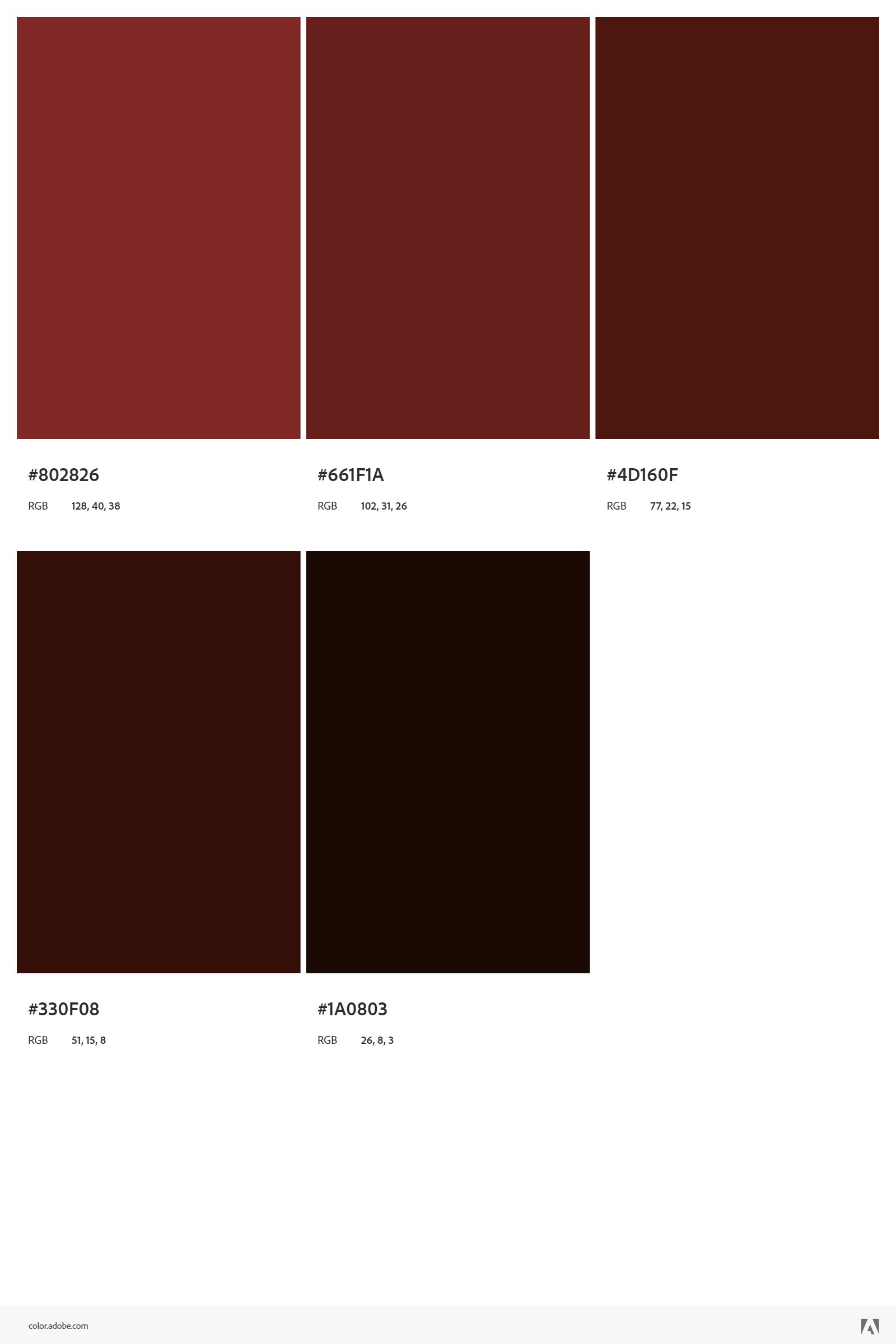
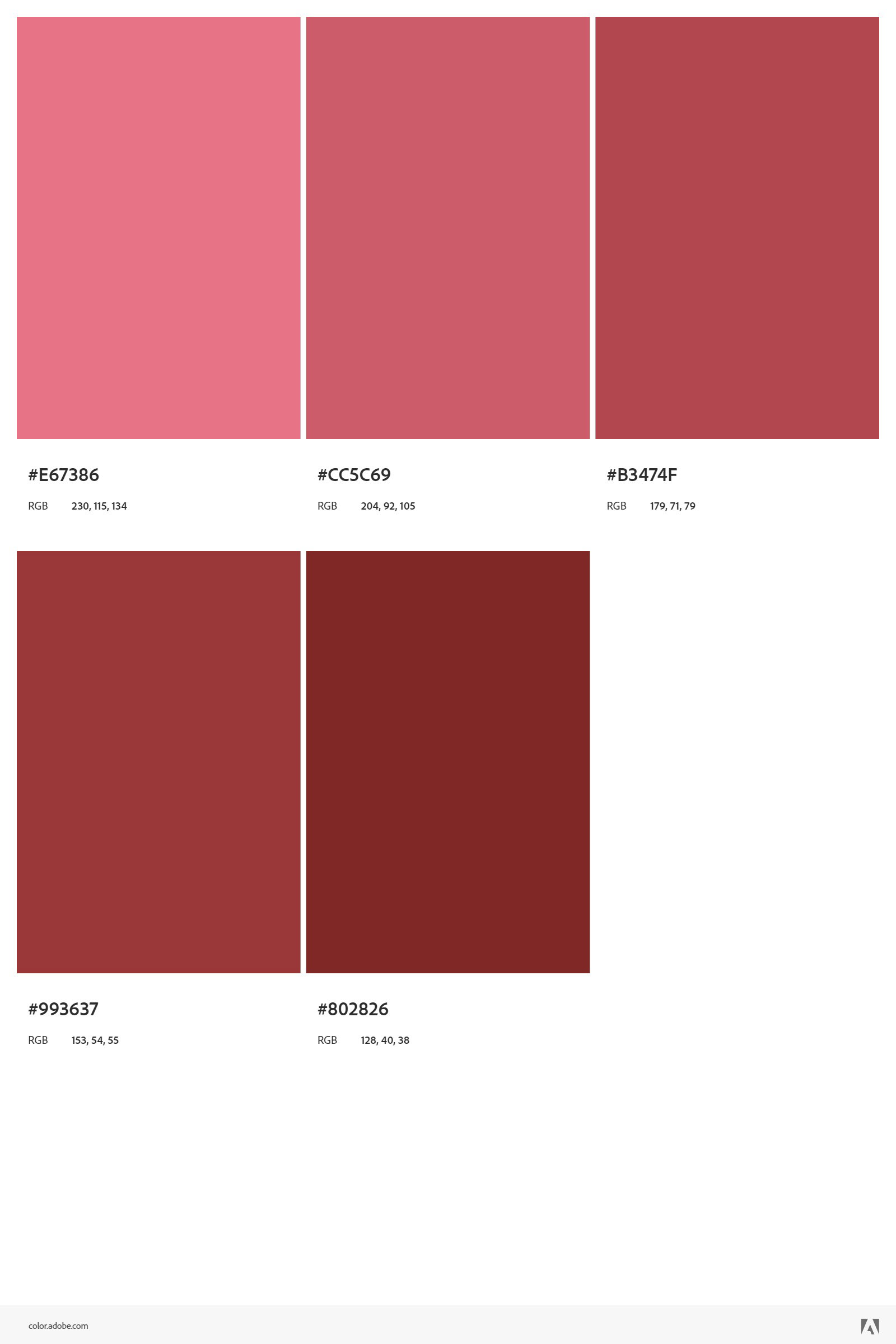
COLOR PALETTES
CLICK THE BLUE LINKS BELOW TO LEARN MORE ABOUT THIS PROJECT
EXPLORE MORE PROJECTS